Bar Time Series Chart
Time Series Bar Charts are used to show the changes in a metric over time as a series of bars. User can also graph multiple series this way, to show the breakdown of a metric across dimensions, and how the values change over time.
- Open a Storyboard, hover the mouse on a chart tile and click the [
 ] icon to maximize the tile.
 - Click the [
 ] icon. The Chart Settings window displays.View
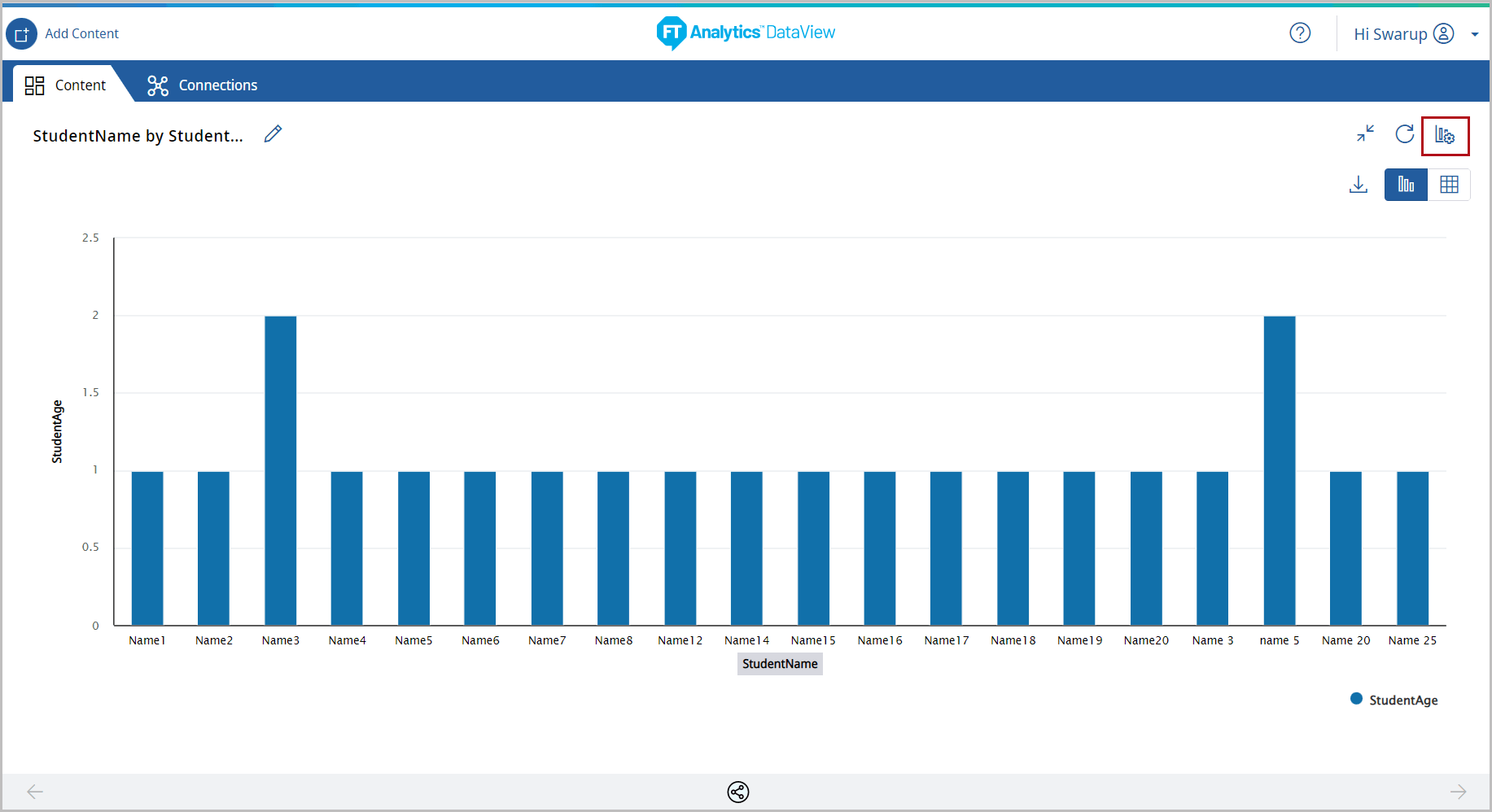 Under the Type tab, the list of available chart types display.
 - Click [Bar Chart]. The available chart models display.
- Select the [Bar Time Series] chart from the Bar Chart section.Chart Settings
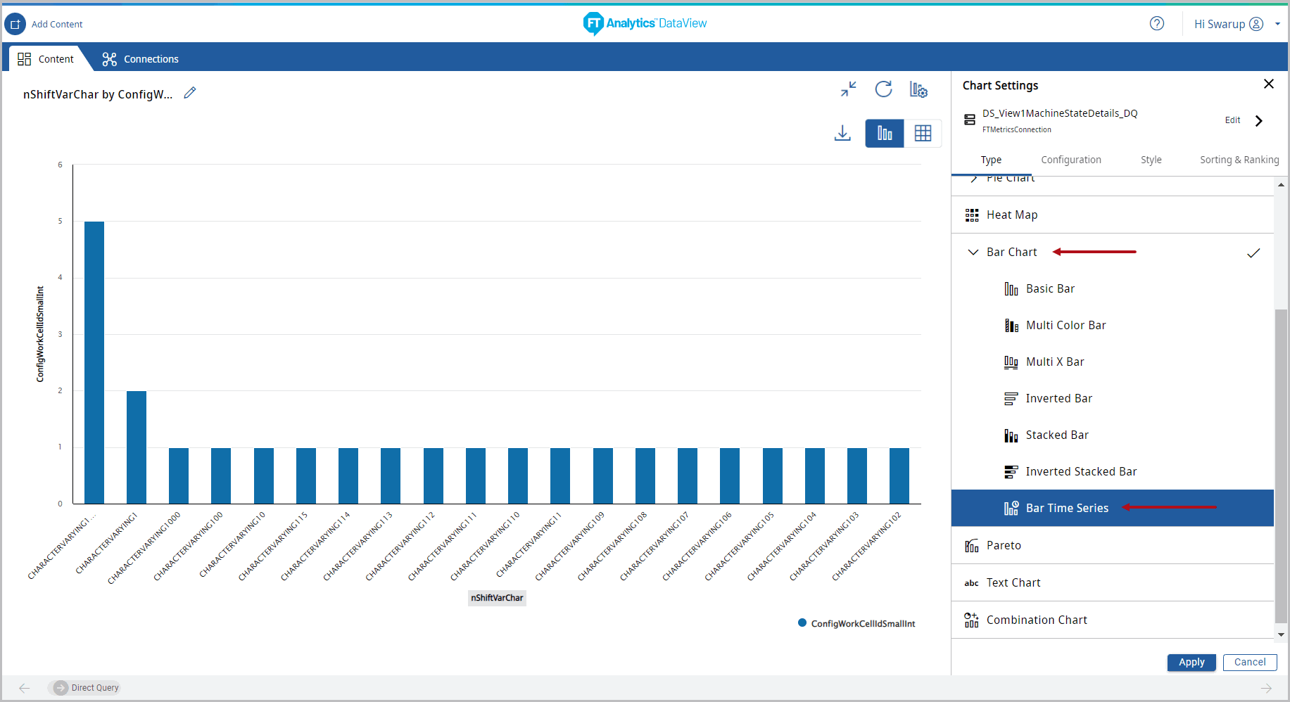 IMPORTANT:A Warning message displays when Time Series chart is selected.
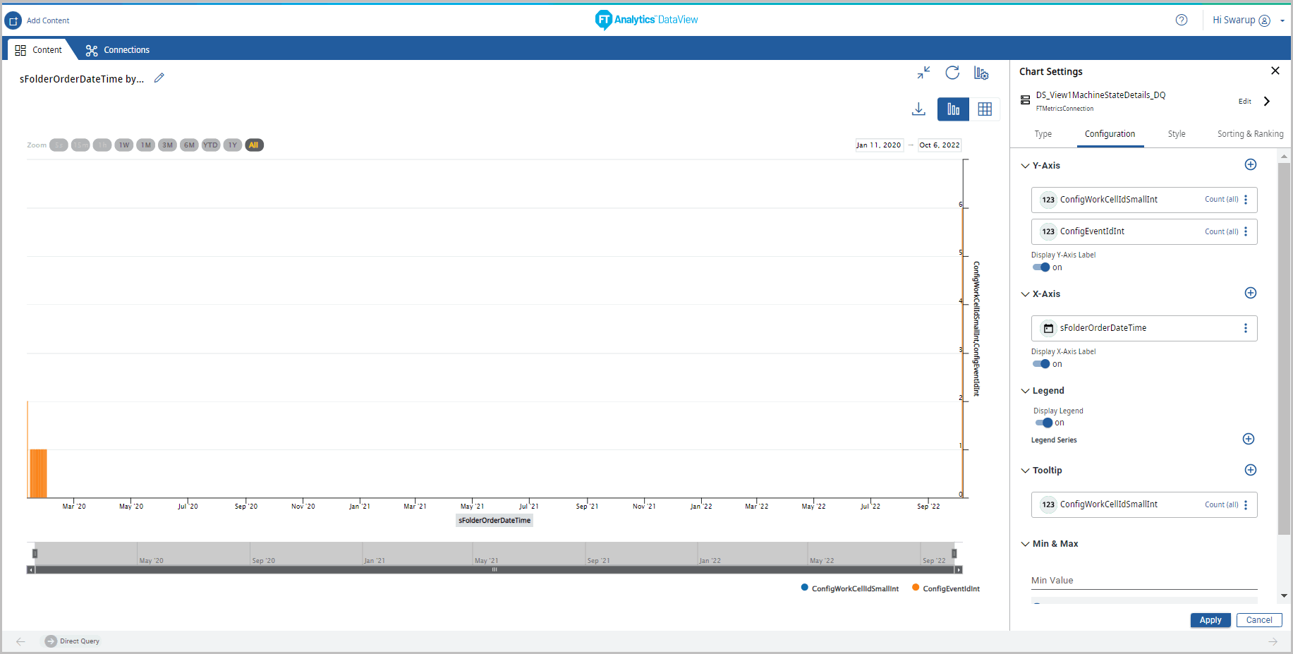
 - Under the Configuration tab, provide the following properties:
- Y-Axis: Select the desired attribute using the [
 ] icon. User can select multiple Y-Axis values for this chart.
 - X-Axis: Select a date attribute on X-Axis to generate Time Series chart, by using the [] icon.NOTE:An error message displays if the date attribute is not selected on X-Axis.
- Legend: Select the desired field from the drop-down list to apply a different series on top of X-Axis or Y-Axis for comparing the available data.
- Tooltip: User can select the values to be displayed on the tooltip.
- Min/Max: User can select the Minimum and Maximum values to display on chart.
- Reference Line: User can set the properties to view the Reference Line on the Chart.NOTE:The Reference Line option is not available, if the Storyboard is generated with direct query.
- Under the Style tab, User can change the following:
- Chart Theme: Change the theme color.
- Chart Settings: User can enable or disable the following options:
- Chart Title, Cross Hairs, Data Label, and Grid Line.
- Click [Apply].Chart Settings
 The Time Series Bar chart displays.Time Series Bar Chart
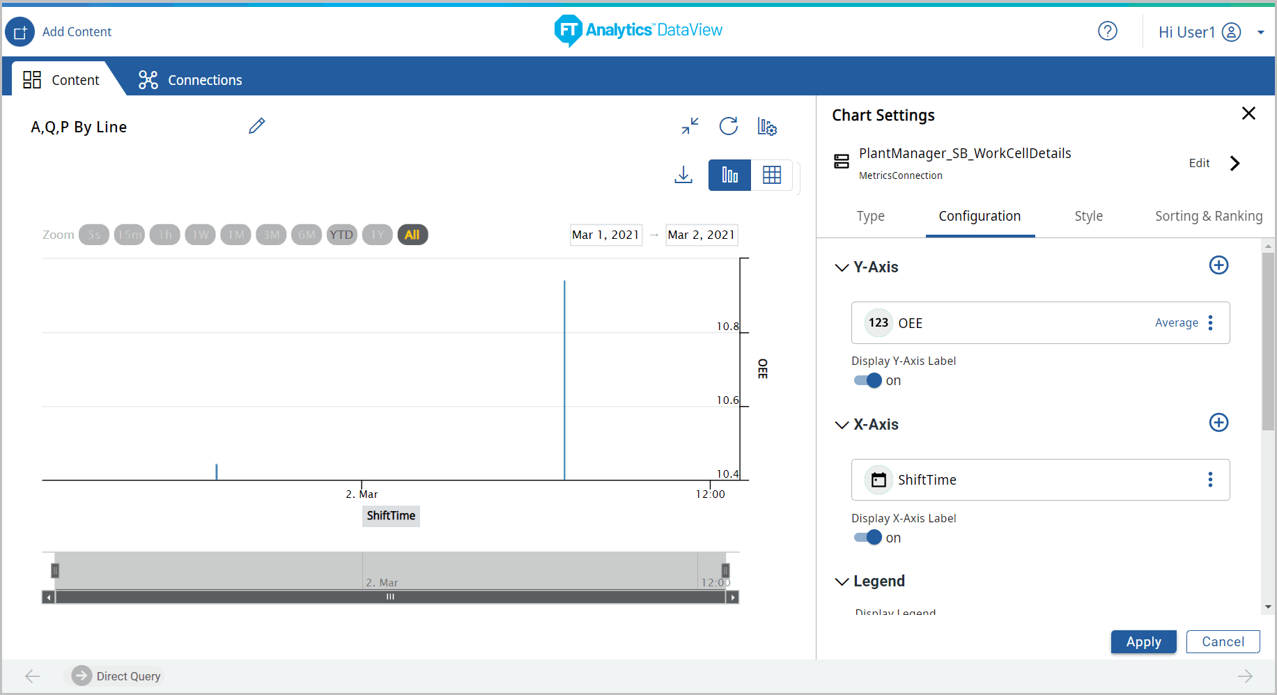
- Click the [
 ] icon to minimize the chart. The updated Storyboard displays.
Provide Feedback