Combination Chart
Enables user to combine several chart types in one chart.
- Open a Storyboard, hover the mouse on a chart tile and click the [
 ] icon to maximize the tile.
 - Click the [
 ] icon. The Chart Settings window displays.Chart Settings
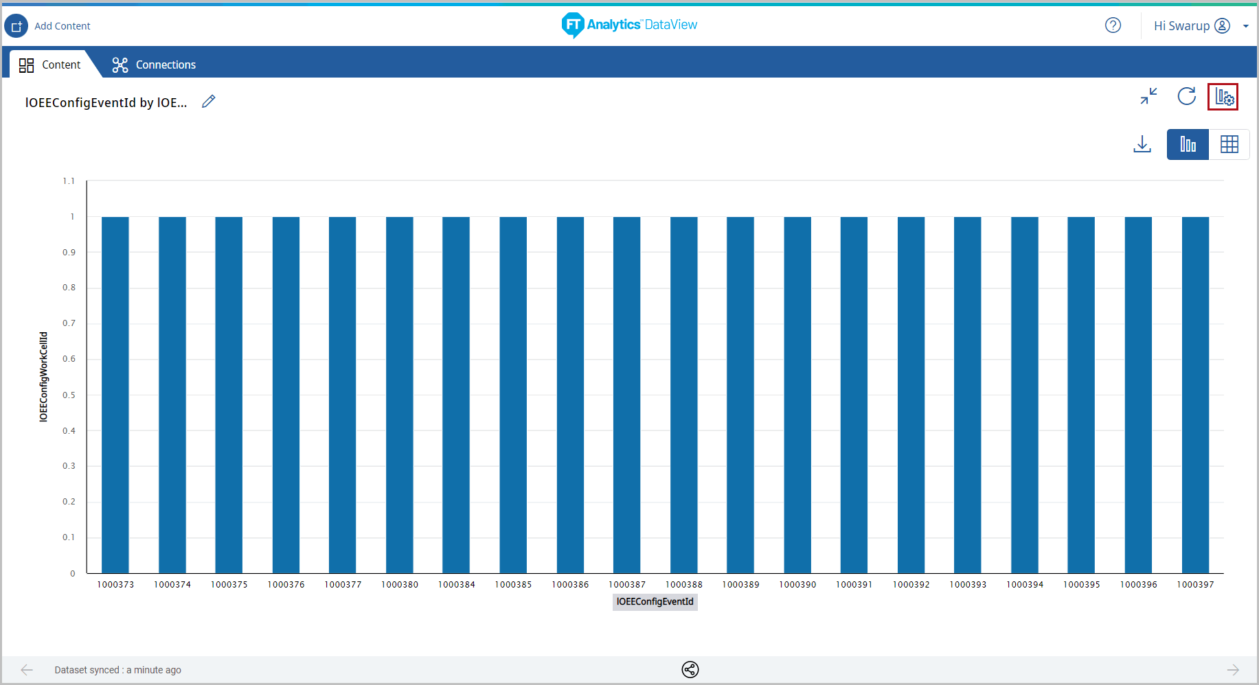 Under the Type tab, the list of available chart types display.
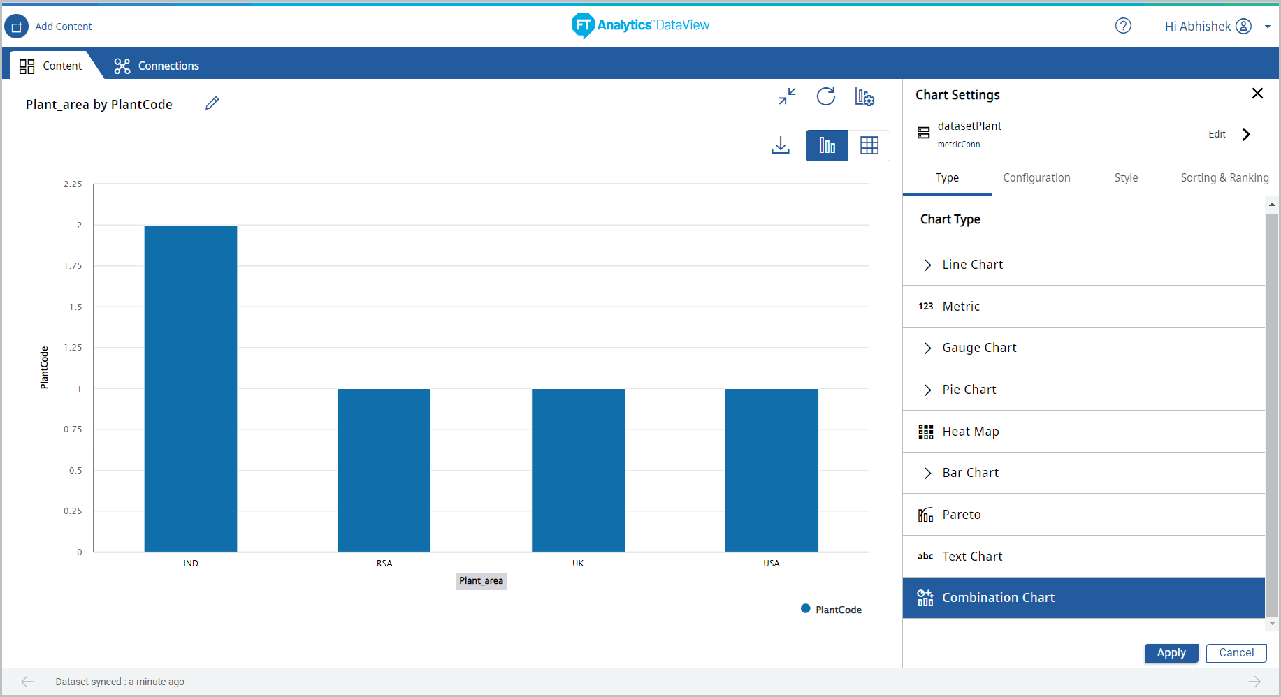
 - Select [Combination Chart].Select Chart Type
 If user tries to click Apply “The Combination chart requires at least two Y-Axis” message displays.Multiple Y-Axis Error
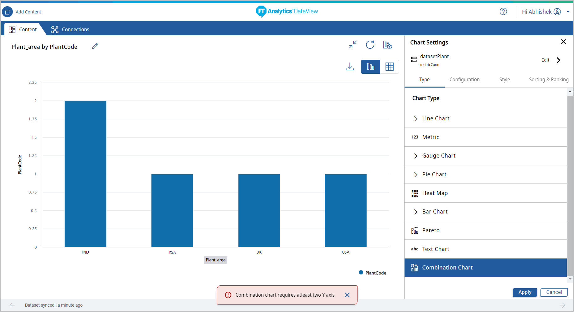
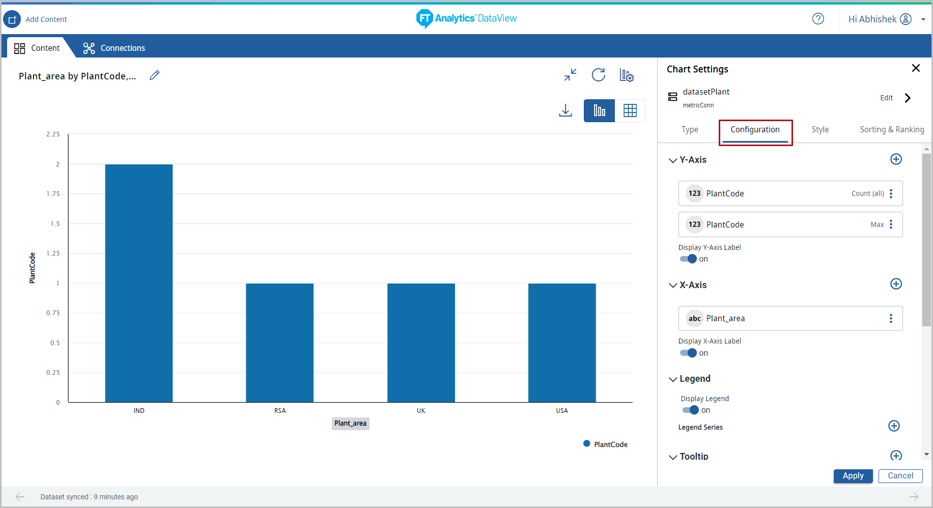
- Under the Configuration tab, provide the following properties:
- Y-Axis: Select the desired columns and set the aggregation using the [
 ] icon. User can add more than one Y-Axis values for this chart.
 - X-Axis: Select the desired attribute using the [] icon.
- Tooltip: User can select the values to be displayed on tooltip.
- Reference Line: User can set the properties to view the Reference Line on the Chart.Chart Settings - Configuration
- Configure the Combination Chart list settings, the selected Y-Axis columns displays:
- User can select the position of the column and can change the chart type.
Chart Settings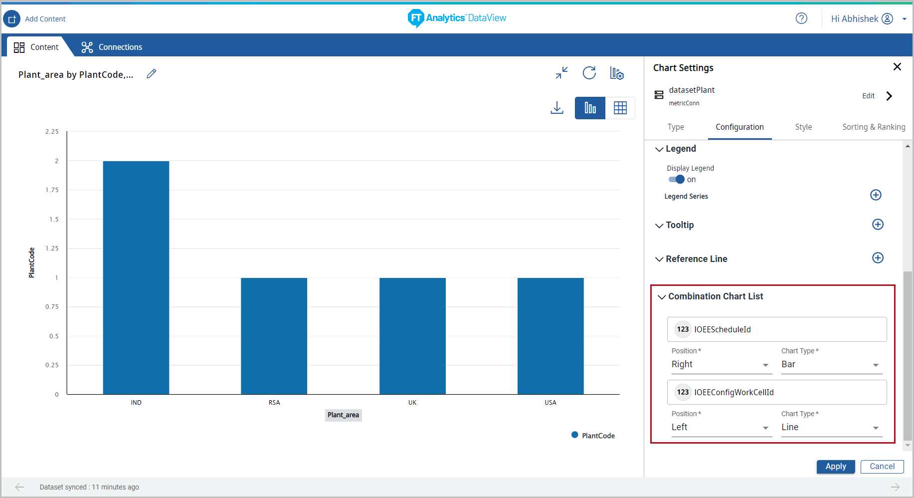
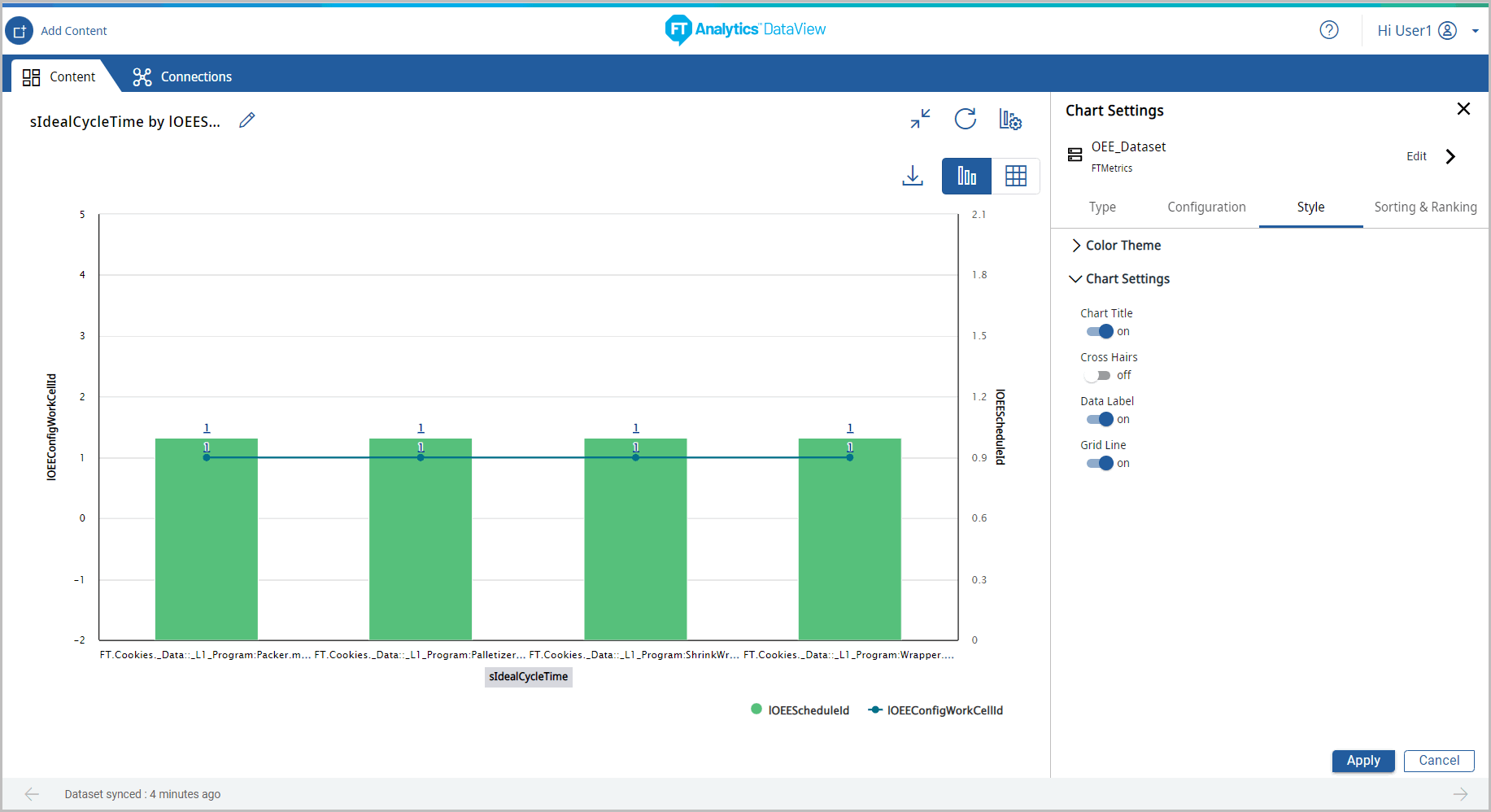
- Under the Style tab, User can change the following:
- Chart Theme: Change the theme color.
- Chart Settings: User can enable or disable the following options:
- Chart Title, Cross Hairs, Data Label, and Grid Line.
- Click [Apply].Chart Settings
 The Combination chart displays.Chart Settings
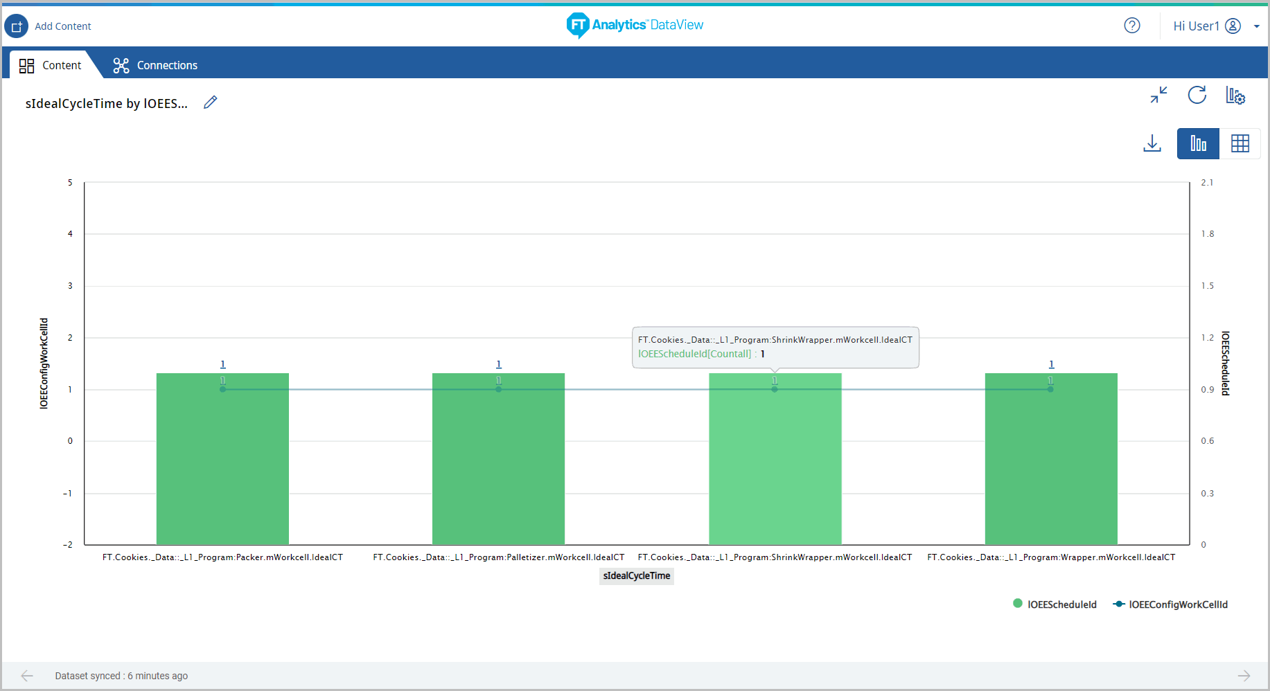
- Click [
 ] icon to minimize the chart. The updated Storyboard displays.Storyboard Updated
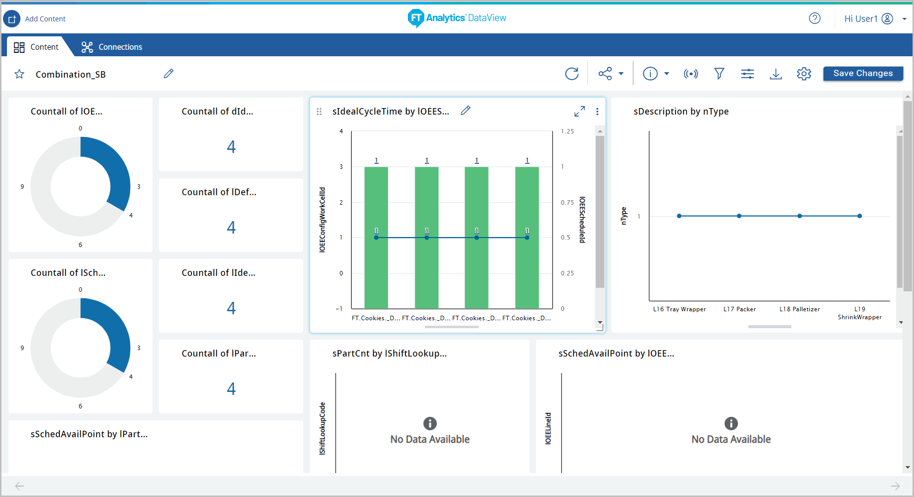
Provide Feedback