Heatmap Chart
A Heatmap chart is a graphical representation of data where the individual values in a matrix are represented as colors.
The heat map is one of the most useful and powerful data-analysis tools available in business intelligence. It is a visualization feature that presents multiple rows of data in a way that makes immediate sense by assigning different size and color to cells each representing a row.
- Open a Storyboard, hover the mouse on a chart tile and click the [
 ] icon to maximize the tile.
 - Click the [
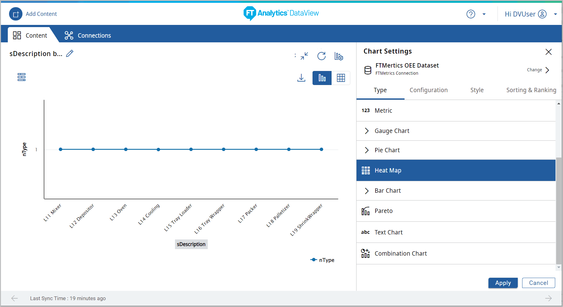
 ] icon. The Chart Settings window displays.View
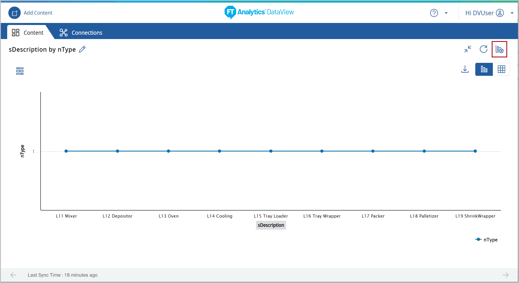 Under the Type tab, the list of available chart type displays.
 - Select the [Heat Map] chart.Chart Settings
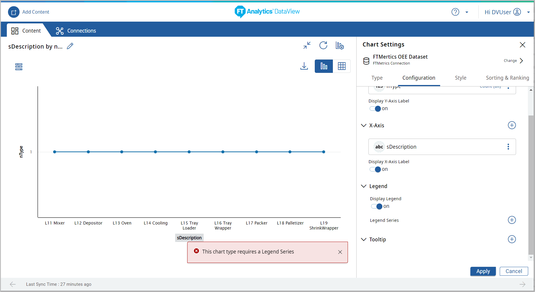
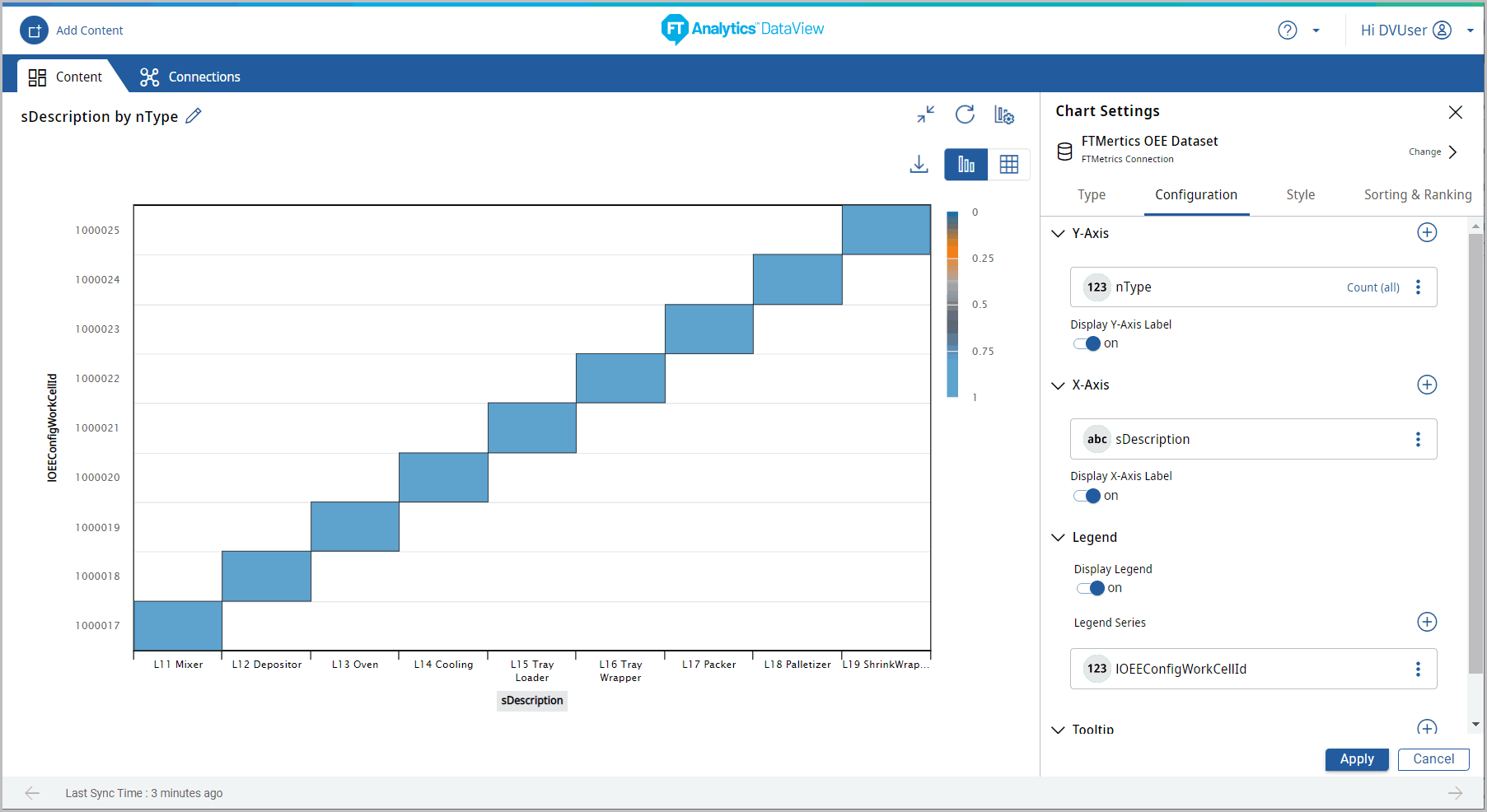
- Under the Configuration tab, provide the following properties:
- Y-Axis: Select the desired attribute.
- X-Axis: Select an attribute of date type.
- Legend series: Select a desired field from the drop-down list to apply a different series on top of X-Axis or Y-Axis for comparing the available data. User can select only one attribute on Legend series.NOTE:If Legend Series is not selected, then the "This chart type requires a Legend Series" pop-up displays.
- Tooltip: User can select the values to be displayed on tooltip.Chart Settings
- Click [Apply]. The Heatmap chart displays.Heatmap Chart
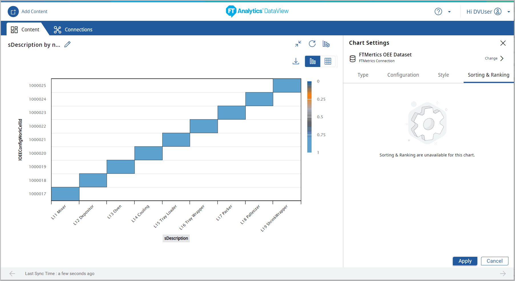
- Sorting and Ranking options are not available for Heatmap chart.Heatmap Chart - Sorting
- Click the [
 ] icon to minimize the chart. The updated Storyboard displays.
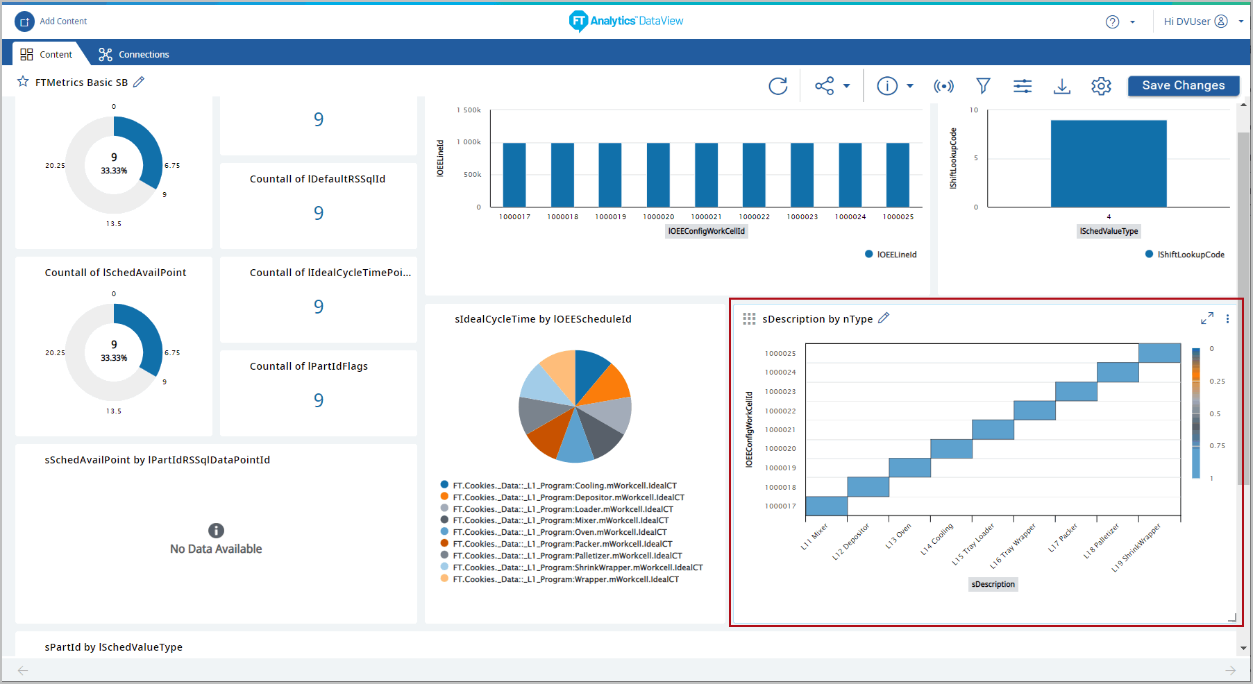
 - Click [Save Changes] to save the Storyboard.Storyboard Updated
Provide Feedback