Pareto Chart
A Pareto chart is a graphical representation of data that contains bars where the individual values are represented in descending order and a line graph that represents the cumulative sum.
It is used to graphically summarize and display the relative importance of the differences between groups of data. It suggests that 80% of problems can be traced to as few as 20% of root causes. Represented by a line series of Data-points extracted from a base series, which is typically a column type. Calculated values ranges from 0% to 100% and should be assigned to additional Y-Axis.
NOTE:
Multiple X-Axis or Y-Axis are not allowed for this chart type.
- Open a Storyboard, hover the mouse on a chart tile and click the [
 ] icon to maximize the tile.
 - Click the [
 ] icon. The Chart Settings window displays.Attribute
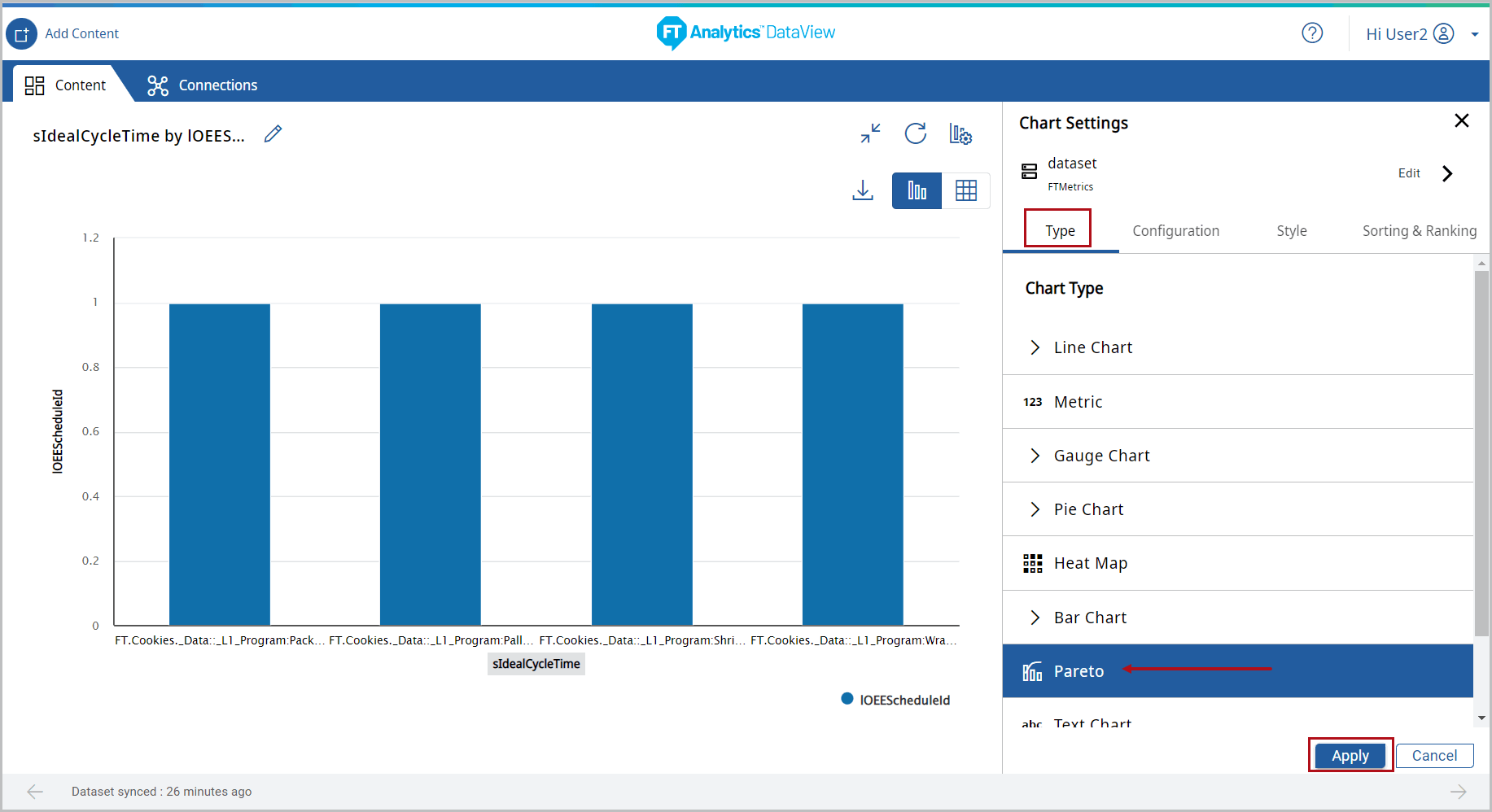
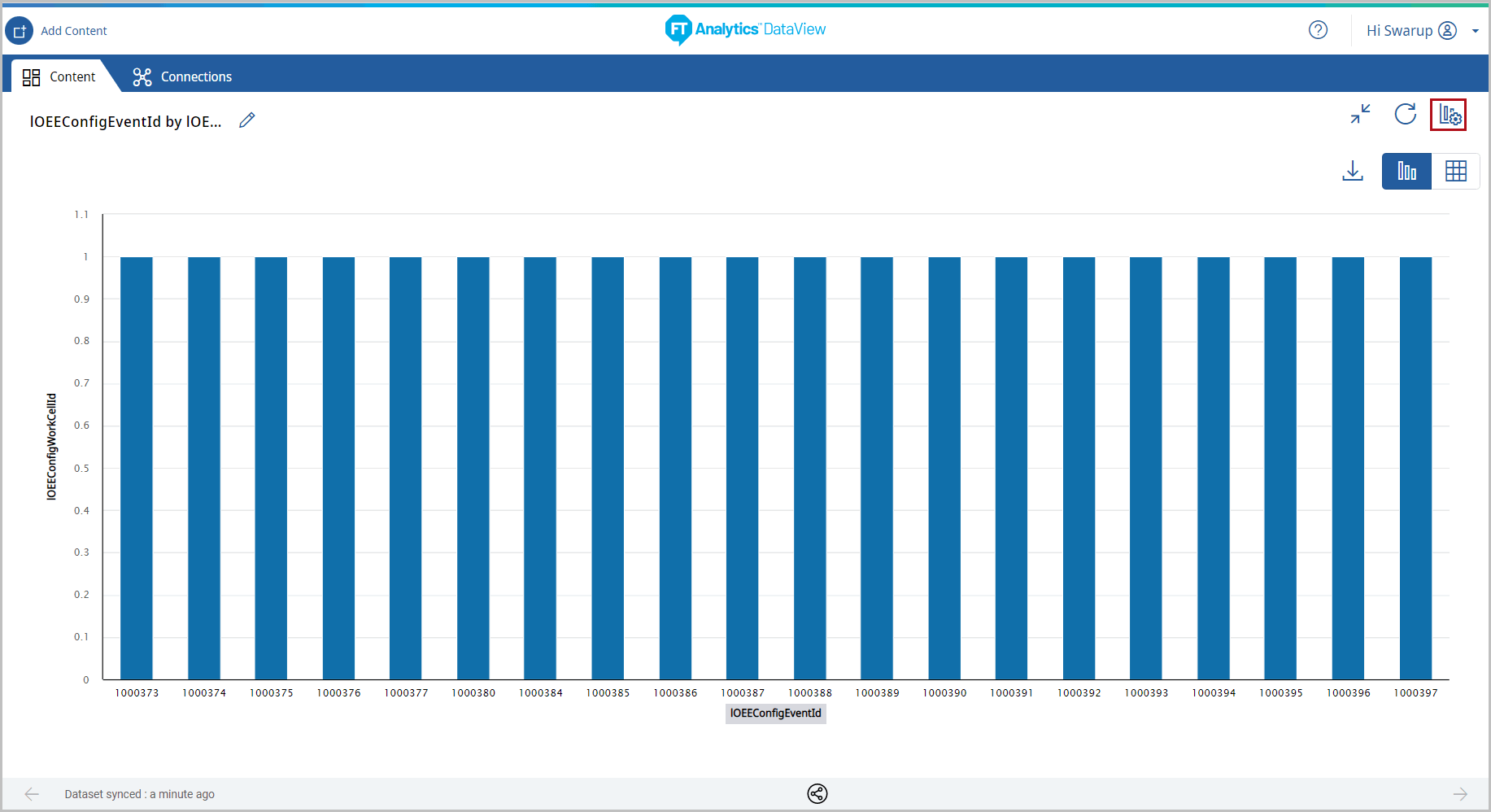 Under the Type tab, the list of available chart type displays.
 - Select the [Pareto] chart.Chart Settings
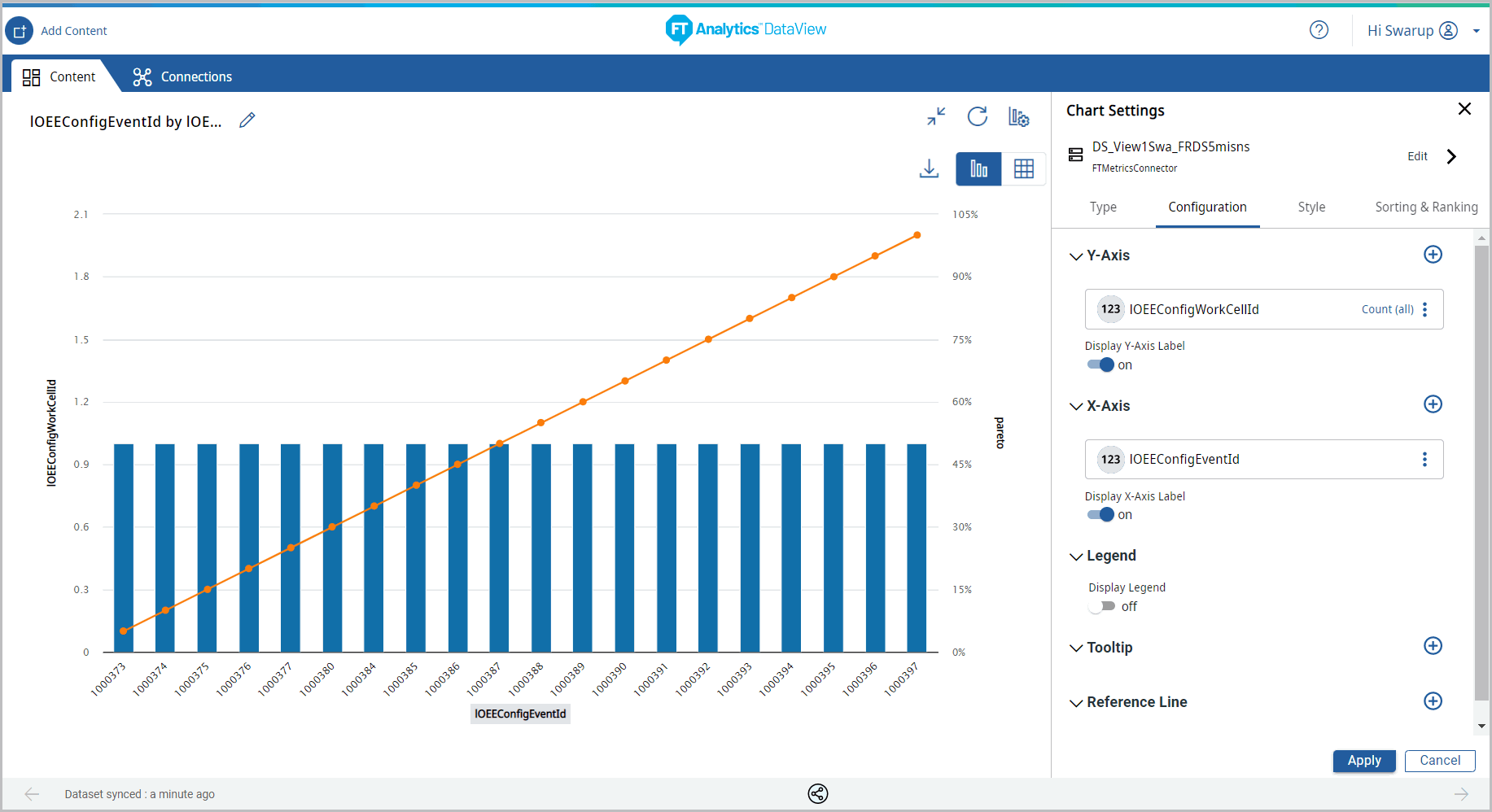
- Under the Configuration tab, provide the following properties: • Y-Axis: Select the desired attribute using the [ ] icon. • X-Axis: Select an attribute of date type using the [ ] icon. • Tooltip: User can select the values to be displayed on tooltip. • Legend series: By default, Legend series is turned on for the Pareto chart. • Reference Line: User can set the properties to view the Reference Line on the Chart.
- Y-Axis: Select the desired attribute using the [
 ] icon.
 - X-Axis: Select an attribute of date type using the [] icon.
- Tooltip: User can select the values to be displayed on tooltip.
- Legend series: By default, Legend series is turned on for the Pareto chart.
- Reference Line: User can set the properties to view the Reference Line on the Chart.NOTE:Sorting option is not allowed for this chart type.
- Click [Apply].Chart Settings
 The Pareto chart displays.Pareto Chart
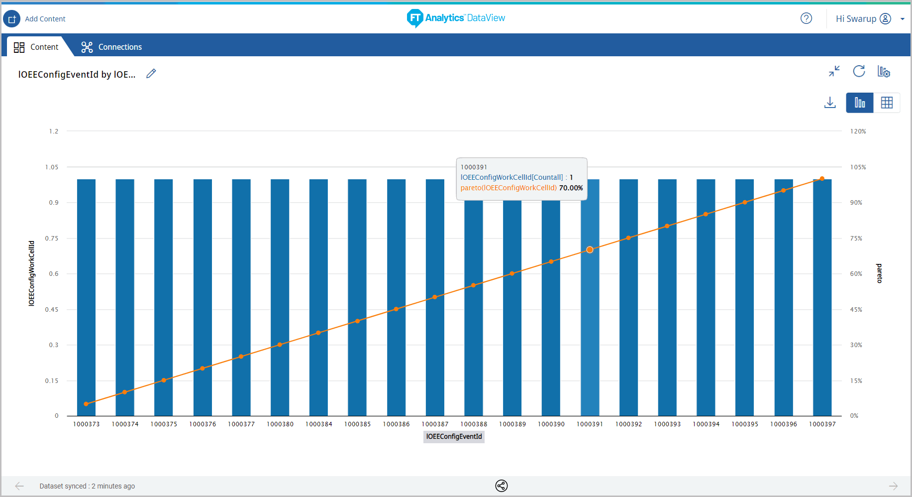
- Click the [
 ] icon to minimize the chart. The updated Storyboard displays.Storyboard Updated
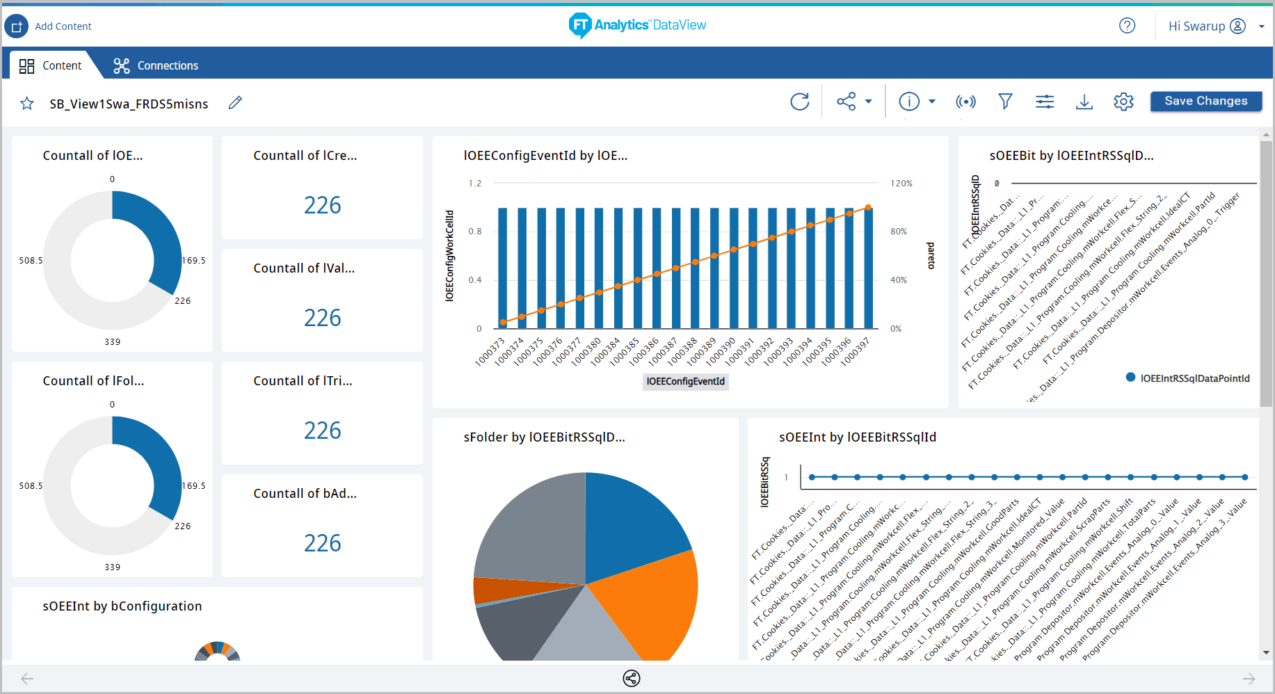
Provide Feedback