Investigate Your Data
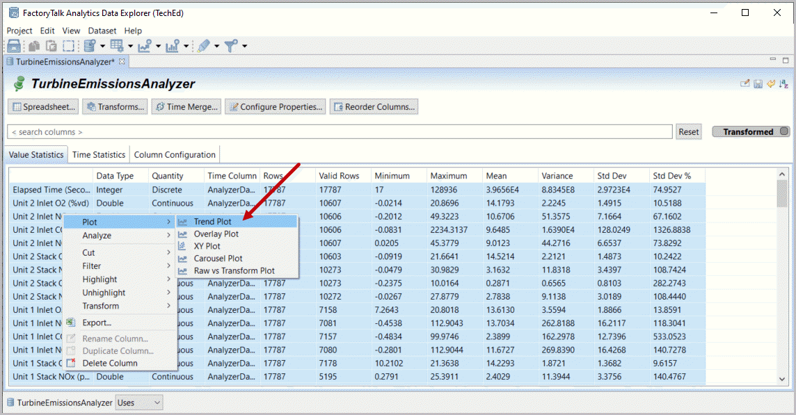
- Note the data is loaded. The number of rows varies between the different data sources (17787 and 65533). You can review the measurement/point names that describe our two turbines (Unit 1 and Unit 2). Statistics are presented for each point. For example Unit 2 Stack NOx has 10273 valid rows (out of 17787), a minimum below 0, a maximum of 30.98, a mean of 3.16 and a standard deviation of 3.44 (which is 108.7% of the mean).Selectthe box outline icon (
 Select All). Then right mouse-click within the greyed statistics and selectPlot and Trend Plot.Data Manifest: Value Statistics
 Dataset Manifest: Generate Trend Plot (all data)
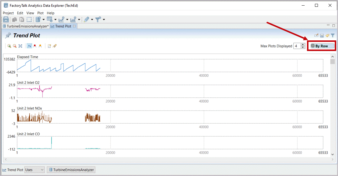
- All data is presented in row plots, which are not aligned across the different datasets.Changethe plot presentation option from By Row to By Time using upper right button.Trend Plot: All Data By Row
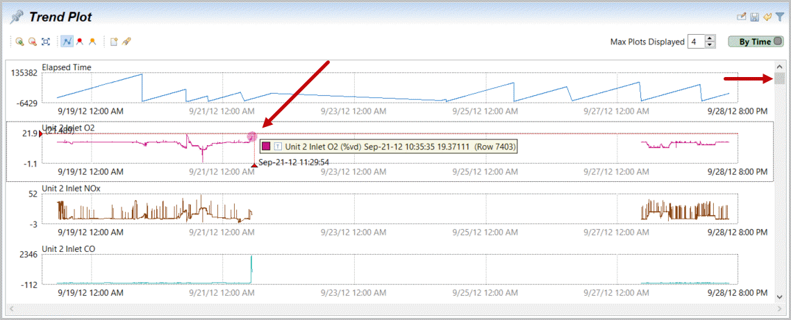
- Now data from our data files are aligned in the plots by time (but no longer by rows). If yourun your cursoracross the data near any visible point you can note that Unit 2 has results (running?) from September 18 through 21 and from September 27 through 28.Scroll downon this analyzer data to locate Unit 1 data using the scrollbar on the right.Trend Plot: All Data by Time
- Note that the Unit 1 turbine seems to be running from 9/21 through 27 (running your cursor over trend plots provides a pop up of time and value).Dragyour mouse (clicked) across a section of the displayed Unit 1 data (this will zoom over that range).TrendPlot: Drag Data to Zoom
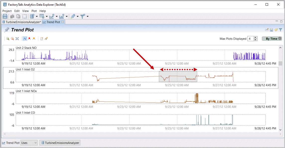
- Zoom is flexible by dragging or using selected ranges (row or time as presented) with the find (flashlight) icon
 . In the upper left additional zoom icons to zoom in (step-wise) or zoom out (where present to your previous zoom level) or zoom back to display all data
 . Next to these zoom tools are additional plotting options, select(turn off) the line button
 .TrendPlot example after zoom
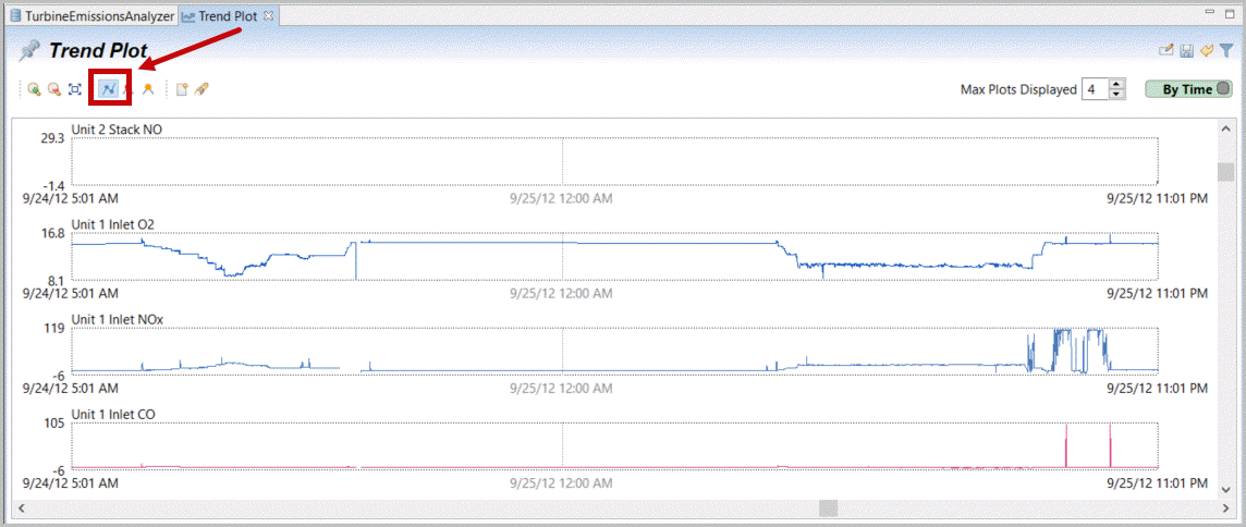
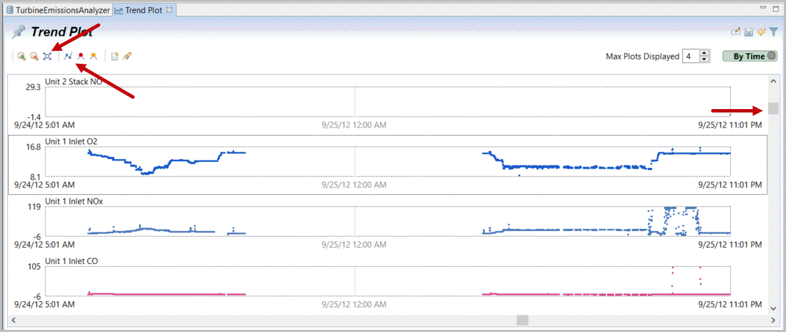
- Note that points are interpolated and Unit 1 is not running the entire interim time. Gaps are filled in with lines between populated times.Experimentwith Zoom and Lines/points. You may notice that average points are not plotted where there are insufficient pixels to display all, but preferentially display extremes (to support identifying events or relationships). Also when in ‘line’ rather than point mode – if zoom is sufficient to display points separately they are displayed with lines automatically.Scrollback to our first points,zoom[
 ] fully out and turn[
 ] line display back on.TrendPlot: Zoom Example without interpolating lines
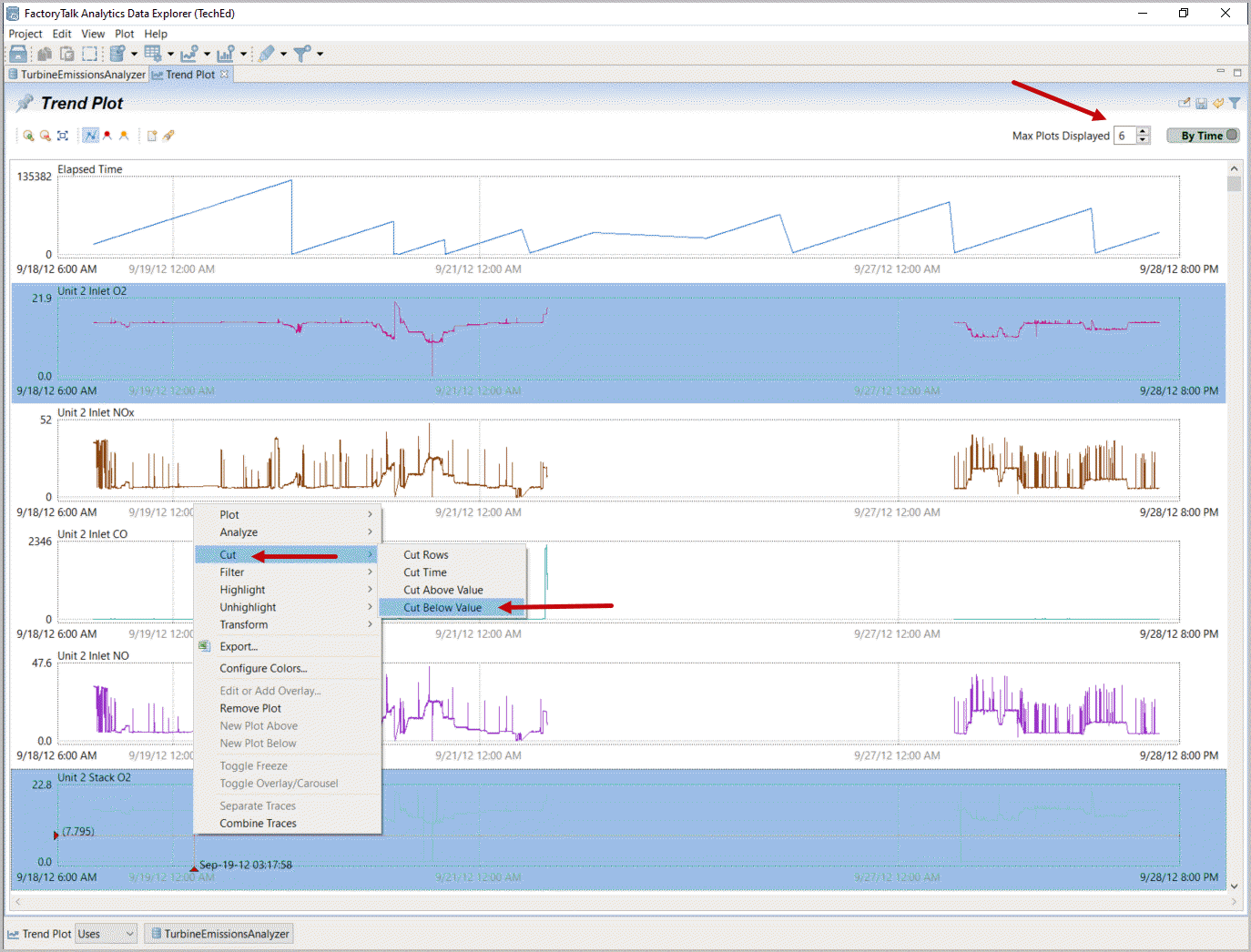
- Maximize the window
 and change number of plots displayed to 6 (from 4)
 . While there are apparent spikes in data for now we’ll leave most of these as is. Selectboth Inlet O2 and Stack O2 (with mouse-click and ctrl-mouse-click).Right mouse-click,selectCut and Cut Below Options. Ctrl-click selects individual plots and Shift-click selects a range of plots.TrendPlot: Multi-Select Unit 2 O2
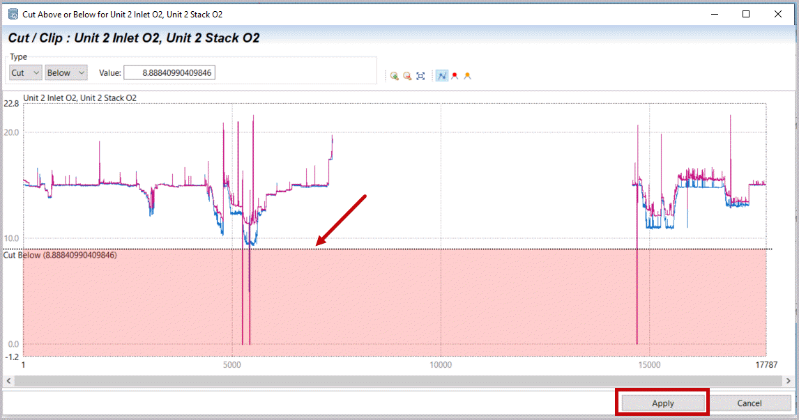
- Dragyour cut Value below the visibly apparent real data on both plots and “Apply”your cut.The two O2 measurements are correlated and we can see (put cursor over any trend values to understand colors) that Stack O2 is sometimes higher than Inlet O2 (duct burner damper?). A zero excess O2 is bad data. A high O2 (up to 21.6% here) is more likely ambient, i.e. without combustion. You may notice controls in the upper left to change from cut (remove data) to clip (set data to limit), from Below (to Above or Both high and low) and to set a specific value (numerically, not graphically)Cut Below: Unit 2 O2 Below About 9
- Data is cleaned.Scrolldown to check the O2 data on Unit 1. No cuts are required. Continue to check the rest of the data (Scroll down).Observe your data and look for more data/time or other issues.TrendPlot with Cut O2 Data
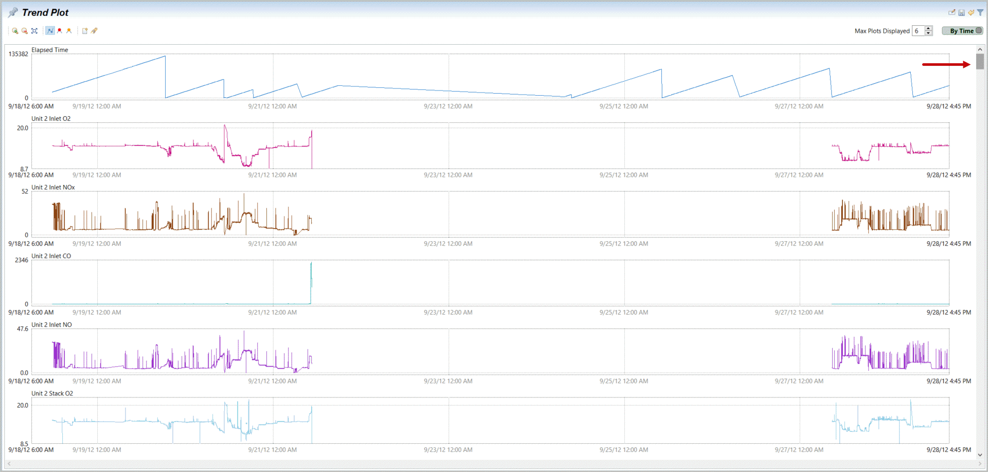
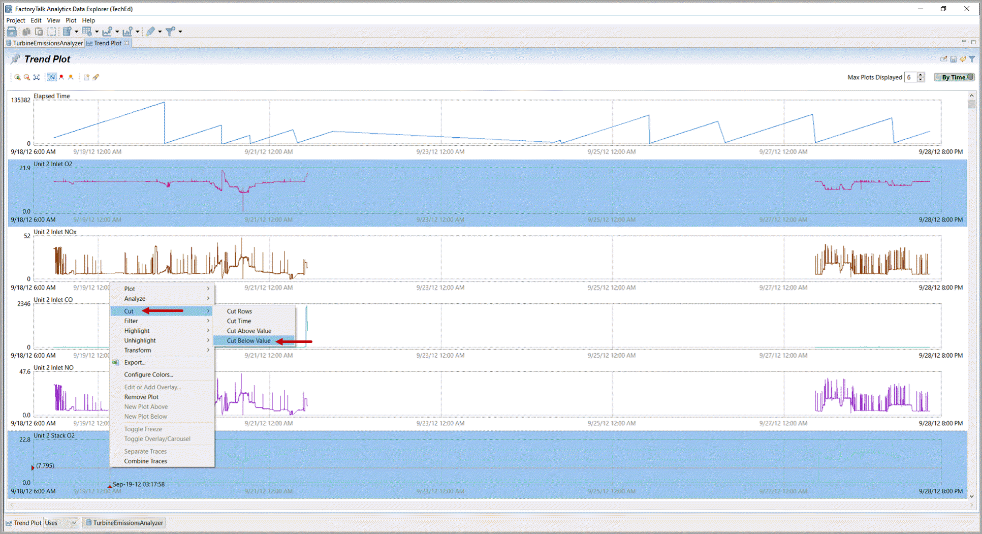
- There are problems with the plant weather station data. Apply cuts (multi-select, right mouse-click,Cut, Cut Below Value) on the problematic Outside Air Humidity and Temperature. Remember multi-select is Ctrl-mouse-click or you may select a range with mouse-click, shift-mouse-click.TrendPlot: Plant Data Anomalies
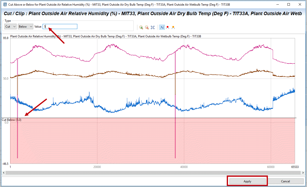
- Cutthe data (dragcut line) below the least value, but above 0 (orsetthe cut below value to 5).SelectApply.Cut Below Plant Data Anomalies
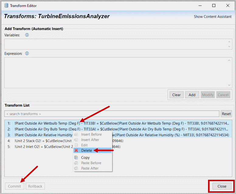
- Thischange did not eliminate all our problem data and it’s possible that the dry-bulb or web-bulb temperature gets below 5 Deg F (it’s only September).Selectthe Dataset, Transforms option from the top icon.Selectour TurbineEmissionsAnalyzer dataset (you may work with more than one dataset at the same time).Select(Ctrl-Click) the three ‘Outside Air” condition transforms where values were Cut below 5. This is our transform list of how we have cleaned/processed the raw data. At the end of an exercise if/when you export part of the dataset for developing a Machine Learning application you will want to execute these same transforms prior to scoring your ML algorithm. In addition you may note that in Interactive Data Exploration data is not eliminated so almost anything is reversible.Right mouse-clickandDeletethese transforms. ThenselectCommit and close.Menu Bar: Dataset Options
 Transform Editor: Delete Unwanted Transforms
- Multi-Selectthe three Outside Air plots again (if needed) and with aright-mouse clickoptionsCutRows or Time.TrendPlot Cut Rows of Plant Weather Data
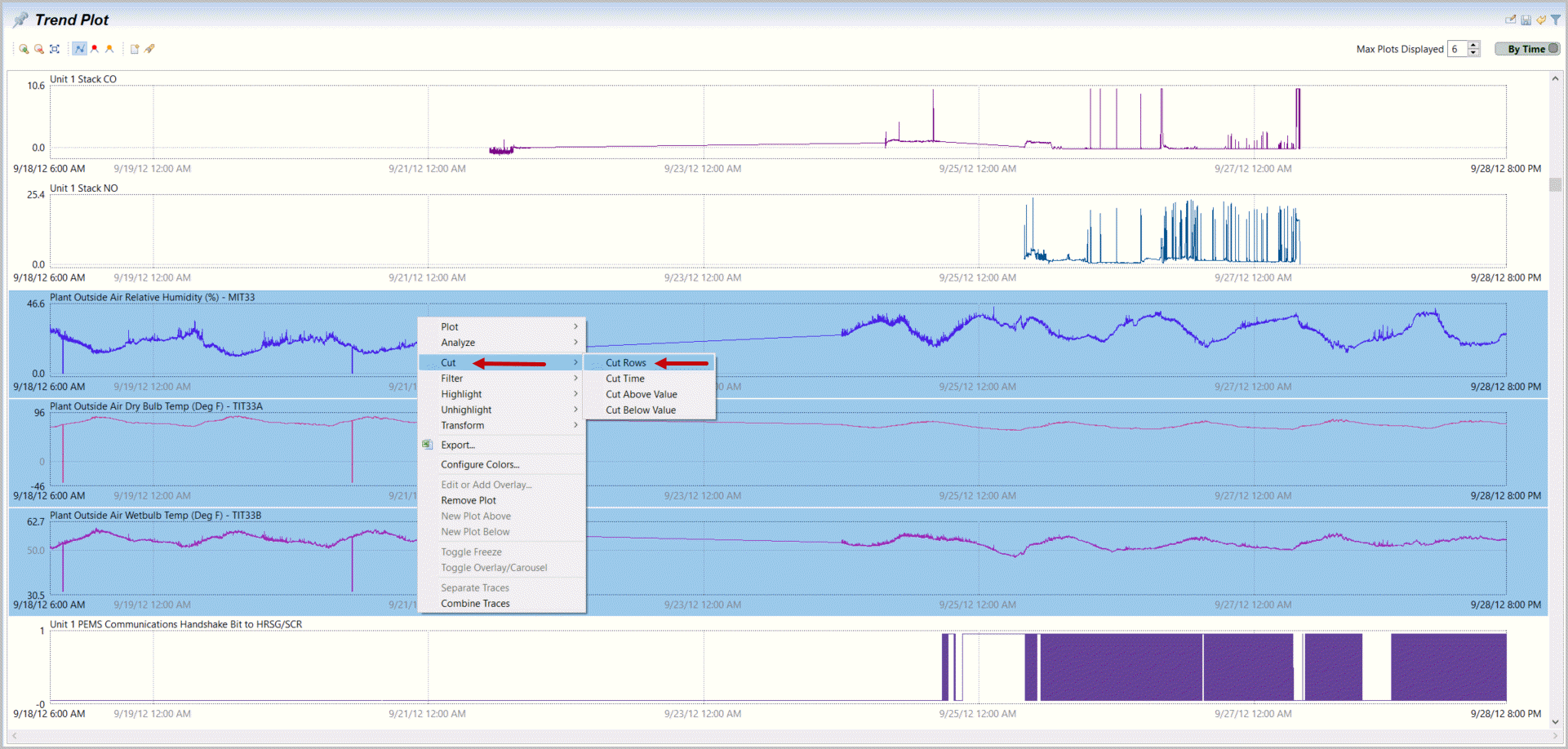
- As needed, you willChangethe upper left plot option from “Drag Cut” to “Drag for Zoom”.Zoomin (by dragging) around the first data drop. You may do this multiple times and if needed reverse one step with the Zoom Out button.Cut Row
 Zoom In
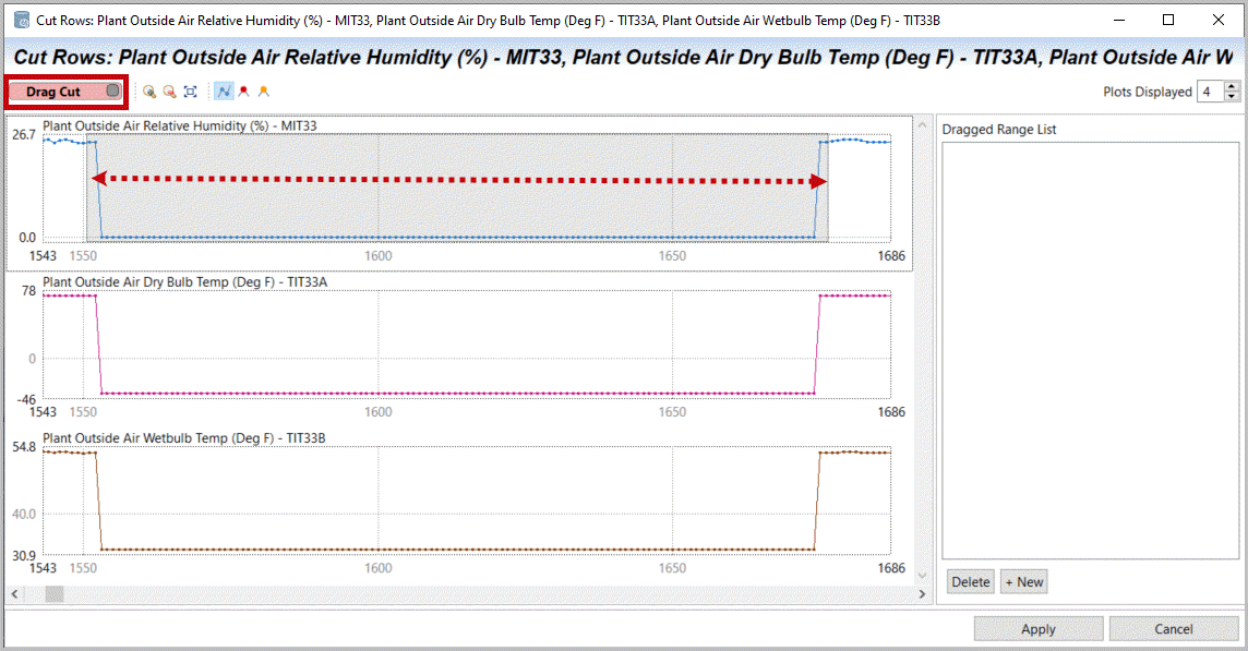
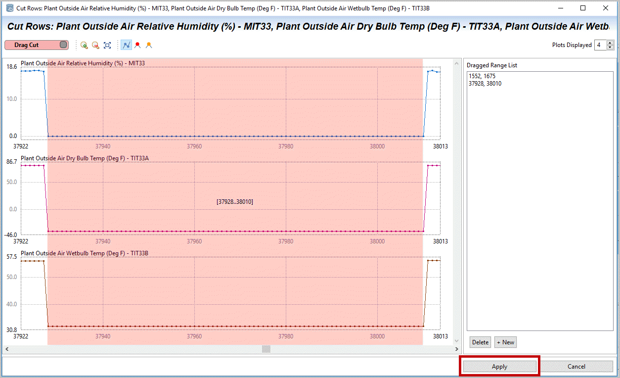
- Changecontext to “Drag Cut” andDragacross the rows that should be eliminated. This can be quicker and simpler if you include one or two extra ‘good’ values on each side. Zoom out andrepeat(Zoom & Drag Cut)for the second data drop later in time on these three measurements.SelectApply with two cuts selected leveraging the zoom tools.Scrolldownthrough your data further to look for more issues or information.Cut Rows: Drag Cut
 Cut Rows: Multiple Drag Cut Regions
- You may notice that other than the analyzer file (emissions) theturbine historical data only goes through 9/24. This is important because we now want to align data on one integrated time-index. This is needed for most Machine Learning tools and for some of our Correlation analytics.Selectthe dataset overview tab (TurbineEmissionsAnalyzer) andselectthe Time Merge button at the top (also available under the Dataset Icon below the menu bar).Turbine Emission Analyzer Dataset Tab, Select TimeMerge wizard
 Menu Bar: Dataset, TimeMerge Option
Provide Feedback
