Time Merge and Analyze Data
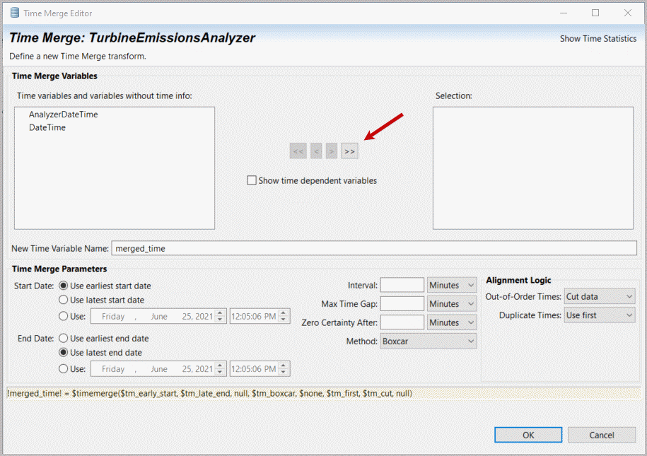
- For our TimeMerge,selectboth displayed (and utilized) Time variables
 , leave“Use earliest start date”, and “Use latest end date”. The “Time Statistics” button can be helpful to select other Merge parameters.Selectand review “Show Time Statistics”.TimeMerge Configuration Page
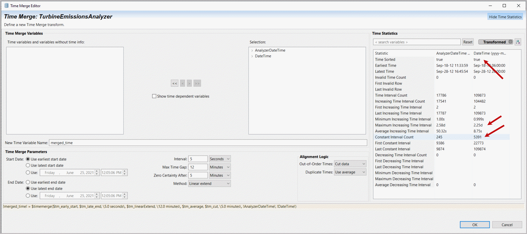
- Time is sorted (all true), soleaveOut-of-order times as is (Cut data). Time statistics around intervals are quite complex and obscure our intervals for merged time. Observing the original data capture is every 5 seconds for process data, 30 seconds for Emissions analyzer data.Setthe Interval to 5 seconds (on other cases you could choose 30 seconds or a different frequency), Maximum time gap to 12 minutes, Zero interpolated value certainty after 5 minutes and interpolation method to “Linear Extend”. There are multiple “Constant’ intervals (duplicate times) sosetDuplicate times to “Use Average”.SelectOK.TimeMerge Configuration, Leverage Time Statistics
- Data is now on a common time basis so that any analysis or machine learning that assumes a time alignment between different sources can use the data.OpenTransforms as shown in the following image orClickthe Dataset icon and click [Transforms].Dataset Open Edit Transforms Two Options


All of the changes we’ve made to our imported data are recorded in our dataset transform list. It may be used directly to add any number of more complex data transformation.
Enter
and create a new variable name, e.g. Unit1 Efficiency (you may use spaces in variable names
or enclose them in “!”) and move your cursor to the open Transform definition window (Expression) and type in
an exclamation mark (!), the character used to delimit variable names. This also opens a variable selection list that you can filter from first character on. Select
“Unit 1 Generator Total Real Power (kW)” or select it as it becomes visible from your variable name filter. Add a division sign (/). Enter
another exclamation mark and select
“Unit 1 CTG100 FUEL GAS FLOW (Lb/Hr) – FT2108S”. Then select
“Add” transform.Add Transform for Unit1 Efficiency

- Editthe variable name, e.g. !Unit2 Efficiency! and move your cursor to the remaining Transform definition window. You may delete, edit or restart any variable name with just an initial exclamation mark locating the right variables (the name needs to exist, as misspelling will be an error on an undefined variable).Changeto divide “Unit2Generator Total Real Power (kW)” by “Unit2CTG200 FUEL GAS FLOW (Lb/Hr) – FT2108S”. Thenselect“Add” again. We will investigate what influences turbine efficiency. When complete (confirm two transforms are added at the bottom) select “Show Content Assistant”.Edit Transform Holdover for a new Unit2 Efficiency

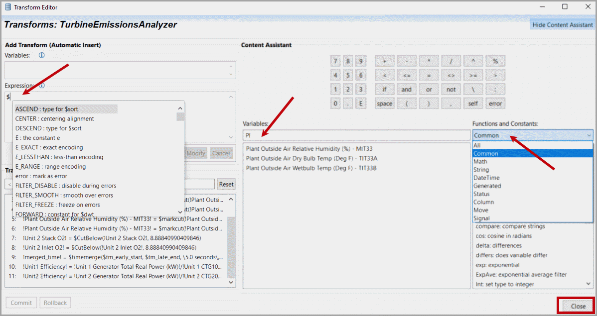
- A keypad and common transforms are displayed. You will see a broad range of functions available under an array of categories (Common, Math transforms, String transforms, Date & Time transforms, Generated: clip/cut/TimeMerge, Status: tests, checks and ways to set cell status, Column: a variety of column transforms, Move: moving window transforms, Signal: frequency domain transforms). Each transform is available by initially typing in a “$” plus the beginning of the transform name or locating an available transform in the Content Assistant window. Note also that If/and/or/not (e.g. nested if statements) can also be created. Search filters for variable names or transforms are available.Select‘Close” at the bottom of the window.Transform Editor Options
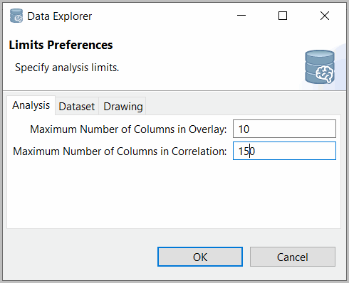
- Selectthe top menu bar, Edit, Preferences, Limits.ChangeMaximum Number of Columns in Correlation: to 150.Edit Preferences
 Edit Limits for Analysis
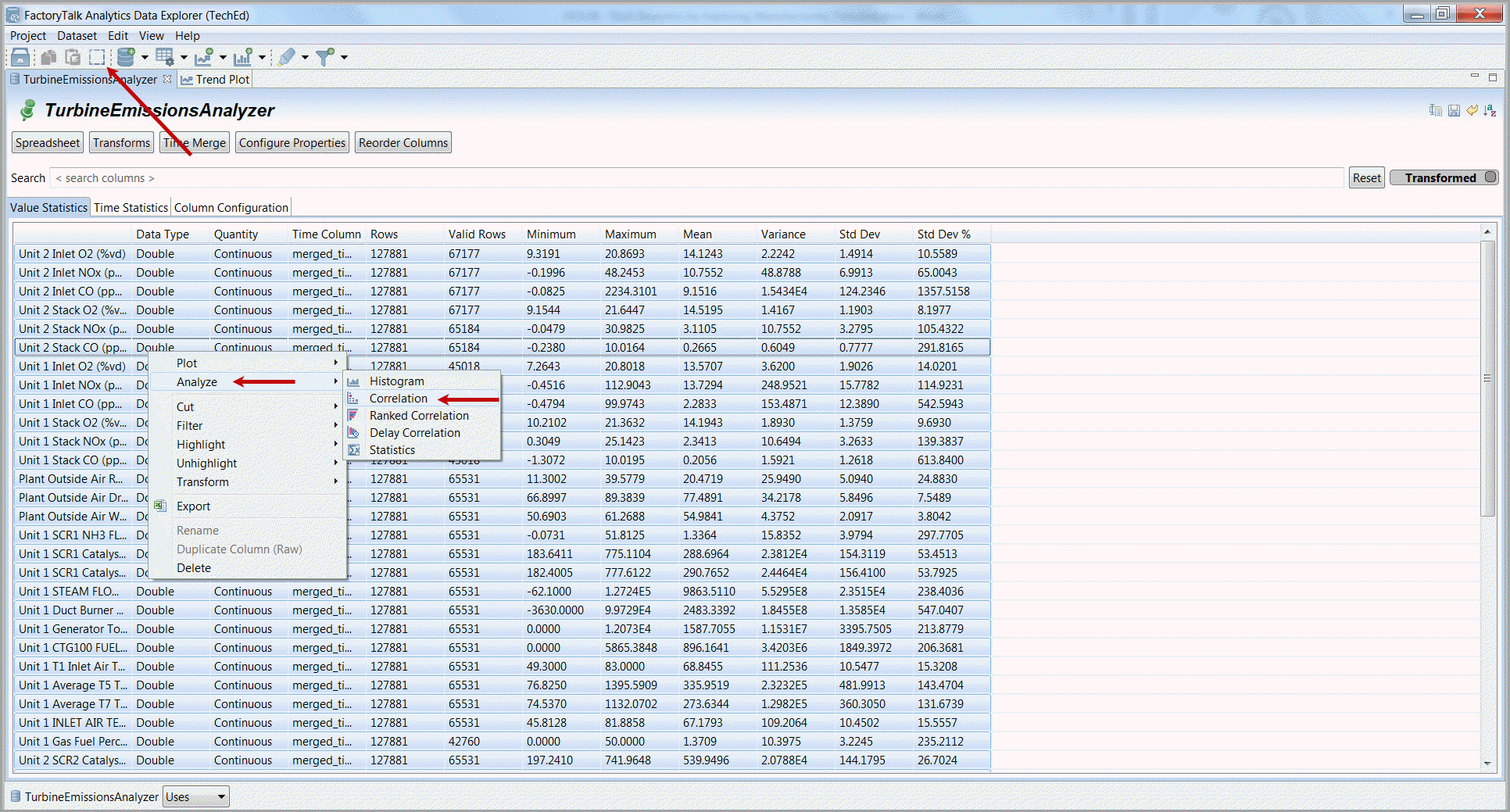
- SelectAll
 , Right mouse-click, andselectAnalyze and Correlation.Analyze Correlations of All Variables
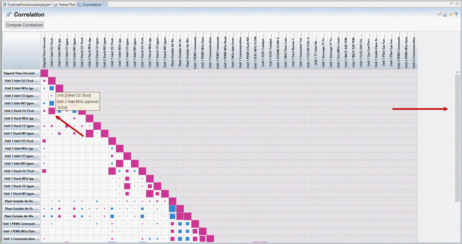
- A Correlation is the linear correlation coefficient (e.g. maximum 1 for variables with themselves, which is the diagonal, i.e. what variables go up and down together) and after selecting all a correlation of each variable with each other variable in the dataset is displayed. Larger squares indicate a larger correlation. Blue rather than red (positive) correlations indicate reflective (negative) correlations. Put your cursor over any interesting square and see the variables (also listed on the axis) and the represented correlation coefficient. To see what is correlated with Unit 2 Inlet NOx observe the box sizes across the third row – until the diagonal (NOx versus NOx) and follow that third column down. The top correlations appear to be: Unit 2 Inlet O2 (-0.559) although there is also a high correlation with Unit 1 efficiency (that will be discussed later, there are few overlapping rows between the two units operations). Because we have completed TimeMerge rows and time are now the same.Correlation Plot of All Variables
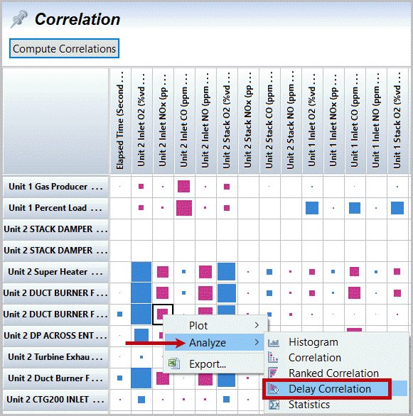
- Selectthat larger correlation box of Unit 2 Inlet O2 and Inlet NOx. Follow the second column down and multi-select (ctrl-mouse-click) about 4 or 5 of the larger correlation boxes including Unit2, Duct Burner Fuel Gas Flow. With your cursor on one of the active, selected correlation boxes. select right mouse-click, Analyze Delay Correlation.Correlation with Unit 2 Inlet NOx
 Select Analyze, Delay Correlation for Inlet NOx
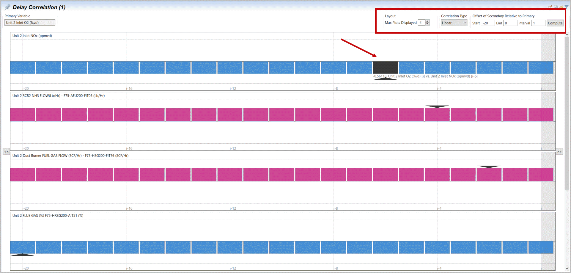
- A Delay Correlation checks the correlation between selected variables (and a primary variable) comparing shifted rows of data (here every 5 seconds step from our time merge). When your cursor is on a bar the values are displayed as pop-ups and when selected shown on the plot (same information). The marked vertical plot indicates that the maximum correlation is 6 (5 sec.) steps where Inlet O2 shifts and then Inlet NOx shifts. Duct burner fuel gas flow appears more strongly correlated 2 steps before. You may shift focus window with right and left double arrows. This starts to indicate the process/system lags represented in time-series data.Analysis, Delay Correlation with Inlet NOx
- Selectyour Correlation tab.Scrollto the bottom right of the correlation chart andlocatethe peak (largest) correlation variable for Unit 2 Efficiency (bottom row).Right mouse-clickandselectPlot and xy plot.Generate xy plot from strong correlation

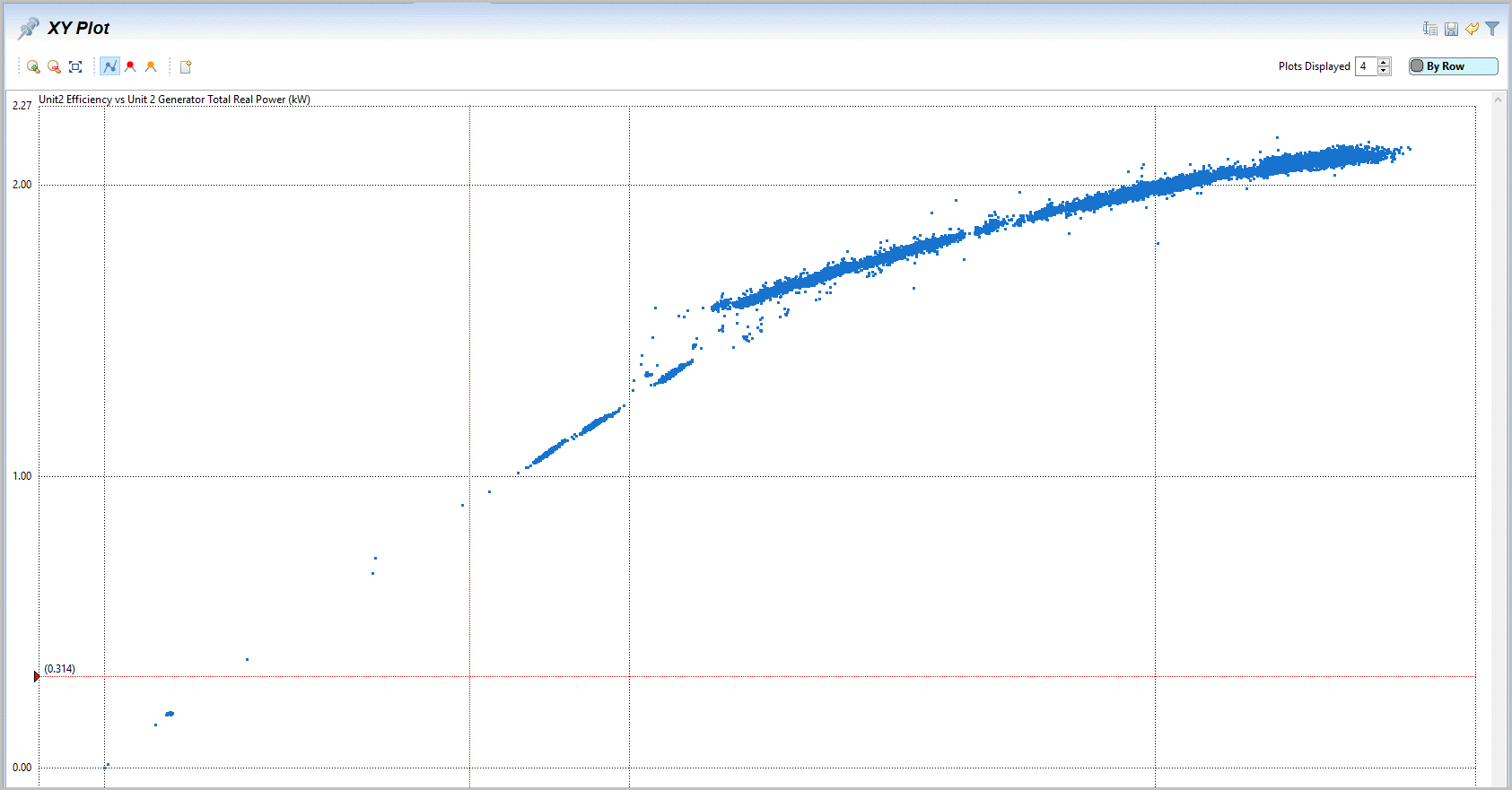
- The high correlation suggested and the xy plot displays a very nice relationship between efficiency and generated power. Increased efficiency increases with total power, but more and more gradually. Unfortunately this is an output and not actionable.xy plot Unit 2 Efficiency vs Power
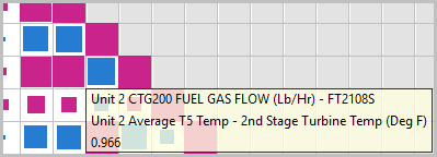
- Go back to (selectthe tab) correlation plot andrepeatfor a few more xy plots on one to two other high correlation variables. Multi-select (select & Ctrl-Select)Unit2 Efficiency versus “Unit 2 CTG200 Fuel Gas Flow” and Efficiency versus “Unit 2 Average T5 Temp-2nd Stage Turbine Temp”.Right mouse clickandselectPlot and xy plot. You will also find these two measurements are highly correlated with each other (just move up vertically until you are two boxes from the diagonal 1.0). Another problem is now we have three different xy plots in two frames.Generate Mutiple xy plots from strong correlating variables
 XY Plot of Efficiency vs T5 Temp and Fuel Gas Flow.
 Strong Correlation between Fuel Gas Flow and T5 Temp
- To provide a more descriptive (understandable) name we can label any plot we want to keep.Double-clickon the plot label (“XY Plot(1)”)orselectthe ‘Rename’ icon
 . Entera useful, appropriate name such as “Efficiency2 vs Fuel and DeltaT”. Alsoselect(activate) the Pin icon [
 ] or Save icon ([
  ] next to the rename icon), which marks any tab as one to save for later access.Rename XY Plot with a Descriptive Label
- Updatethe tab names and ‘pin’ the first xy plots (e.g. something like “Efficiency2 vs Total KWh”). Nowselectthe Project Cabinet icon in the upper left just below the Project taskbar option. The project cabinet also supports renaming or removing project items with a right mouse click.Save (Pin) and Rename Efficiency2 vs Total KWh

- Our ‘pinned’ tabs are retained as part of our project set-up and can be recovered if closed, by opening the project definition [
 ] and selecting the desired, pinned tab (plots, datasets and analysis). Pin (save the configuration) of any reusable tab. To update this in the file system, close the project definition window by selectinganywhere outside it and thenselectthe taskbar option “Project” and “Save”.Project Cabinet
 Project Manu Bar Options
Provide Feedback
