Filtering Data
You can filter data in a plot or analysis tool using the Filter icon. While filters are not as graphically additive as the highlighter, many initial filter steps can be generated from the plot including keep above, below, between, rows, time, when any valid, and when all valid.
- Click theFiltericon to open aDatasetFiltertab.Dataset Filter Tab
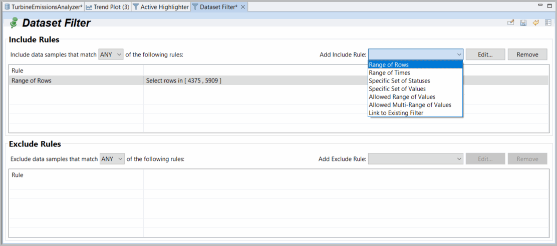
- For each of theInclude RulesandExclude Rulessections, from theAdd Ruledrop-down menu, select a type of filter rule to add. You can choose from the following:
- Data within a range of rows and times
- Data within a specific set of statuses and values
- Data within an allowed range or ranges of values
- Data linked to an existing filter
You have the option to include/exclude data that fulfills any of the listed rules or all the rules listed.For example, you want to create a filter that displays specific data that occurs within a certain range.- UnderIncludeRules, select theAllowed Range of Valuesrule type > click [Select Data Column]. The Selector displays.Dataset Filter Example
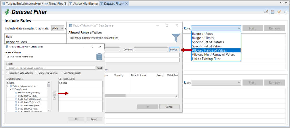
- Select a column, add it to the right panel using the arrow key, and click [OK].NOTE:Any or All options at the top for combined rules selected independently for Include and Exclude rules. Filters use Any or All rules as selected. Highlighters or highlighters converted to filters use a sequential set of graphical selections or de-selections.Select Column
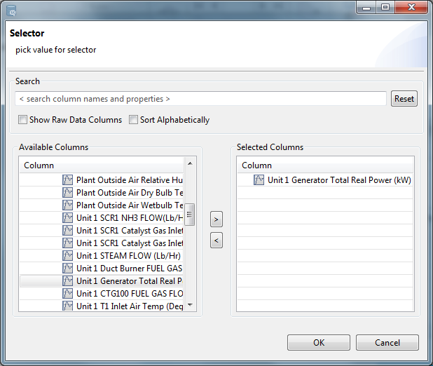
- Define a range a click [OK]. You can define either the upper range, lower, range, or both.
- To remove a rule, select the rule and click [Remove Selected] in the appropriate section.
All filters are automatically pinned by default (for example, retained as part of the project). You can remove a filter by un-pinning it or explicitly removing it in the project view. To edit a filter, open the drop-down menu of the Filter icon and select the filter you want to edit.
To use your filters, click the
Filter
icon to the far right of your tab.- For a plot, define a color to use for displaying each different filter. You can do this by either dragging the filter to the color or by selecting both the filter and the desired color and then clicking the right arrow. Check theShow Unfiltered Datacheckbox to include the unfiltered data as a baseline.It is recommended that you rename these filters with meaningful names. For example:
- First Shiftfilters times between 0800 and 1600. Blue is used for this filter.
- Second Shiftfilters between 1600 and 0000. Red is used for this filter.
- Third Shiftfilters between 0000 and 0800. Brown is used for this filter.
As a result, the plot for one variable will be blue during first shift, red during the second shift, and brown during the third shift.Click [OK] to add the filter or [Reset] to remove all filtering.Select Filter (Plot)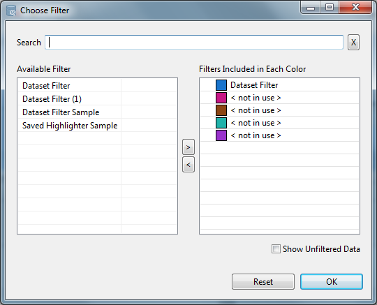
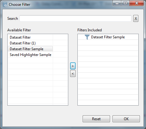
- For an analysis tool, define a filter by selecting the filter and then clicking the right arrow. Click [OK] to add the filter or [Reset] to remove all filtering.NOTE:For most plot tools, you can choose multiple filters, and each gets a color code or may be combined. However, for many (but not all analyses), it only makes sense to compute based on a single filter choice and there is no concept of color coding. If you double-click a filter a “NOT” will be added or removed.Select Filter (Plot)
Provide Feedback