Plot Example
The following discussion and sample figures assume a
Trend
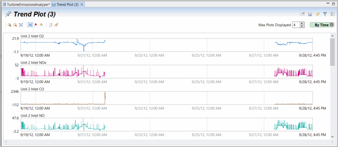
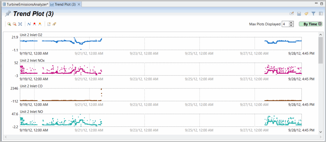
plot is being used. By default, all data is presented in row plots, which are not aligned across the different datasets.- To change the plot presentation option from Row to Time, click [By Row] in the right corner. As shown in the following image, the data from your data files are now aligned in the plots by time.Trend Plot by Time
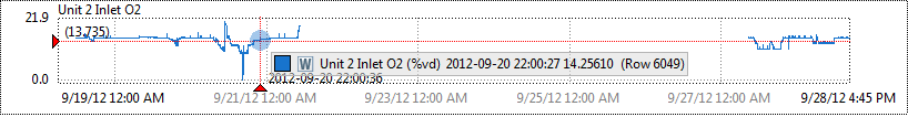
- To view information on a specific data point, run your cursor across the data near any visible point. In the following image, you can see that Unit 2 has results from September 18 through 21 and from September 27 through 28.Trend Plot by Time (Results)
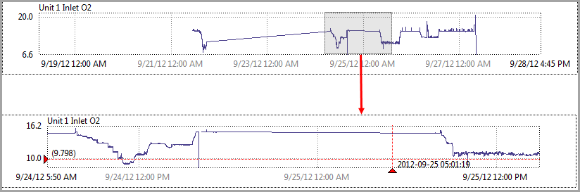
- To zoom into a specific section of data, click and drag over that selection. When you release the mouse, the zoomed-in section displays as shown in the following image. Use the Zoom In, Zoom Out, and Zoom Out Fully to further change your display.Data Zoom
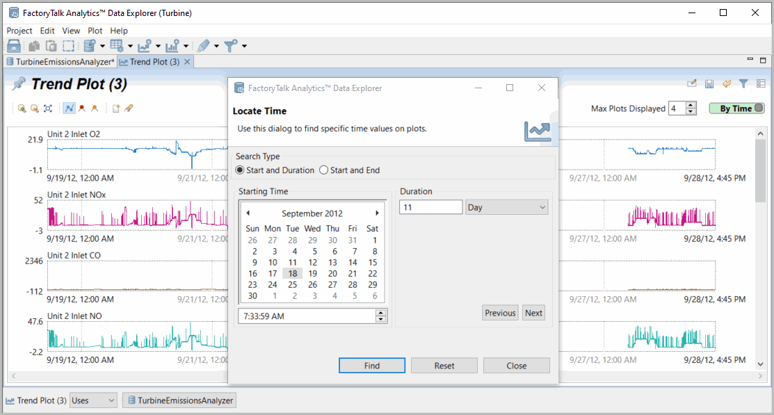
- To find specific data, click theFindFind icon to define a specific time (if By Time is selected) or row (if By Row is selected). In the following image, you would either enter the starting time and duration (default) or the start and end times and then click [Find].Find by Time
- Note that points are interpolated, and data not present over the timeframe selected in the plot may not be significant.
- By default, the gaps between populated times are filled in with lines. Click theShow Plot Linesicon to remove these lines (see the following image). When plot lines are displayed:
- You may notice that average points are not plotted where there are insufficient pixels to display them all. Instead, extremes are displayed to support identifying events or relationships.
- If the zoom level is enough to display points separately, they are displayed with lines automatically.Plot Lines Not Shown
Provide Feedback