Asset Level Dashboard
In this dashboard, you can view the overview of the Asset. Based on the configuration, respective KPI details are displayed in the
Overview
tab.Select the required Asset from the hierarchy list and you can see the following tabs in the dashboard:
- Overview
- KPIs
- Sensors
- Info
Overview
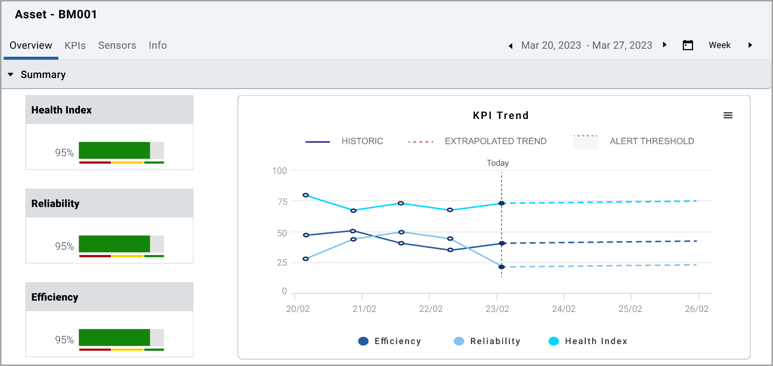
tab:You can view the status of the site and the configured KPIs across the application under the selected site and the top five underperforming assets in the selected time frame. You can also view the active alerts with severity, actions taken, and the current status of the alert.
Summary chart
NOTE:
Click the [>], [>>], [<], [<<] paginator icons in the summary graph to move forward and backward to view the data.
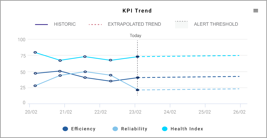
In the KPI trend chart, three lines indicate the three different KPI data, the solid lines indicate the historical data, and the dotted line indicates the extrapolated future projected data.
When you click over the dotted line, you can see the red color dotted line that indicates the alert threshold line.
Threshold chart
You can view all the
Open/In-Progress Alerts
of both Asset and Component levels rolled-up to the Asset. The following are three different types of alerts with respective hierarchy location applicability, and links to additional information in the document: Alert type | Hierarchy Location | Links to Additional Information |
|---|---|---|
Open/In-Progress Alerts

NOTE:
You can use the [ ] in the respective column to filter based on your needs.
You can view the health of the components configured under the asset with a risk score, remaining useful hours, data availability confidence, and alert count.
To change the time period, click the [ ] icon and select the required date in the
From
and To
box.KPI
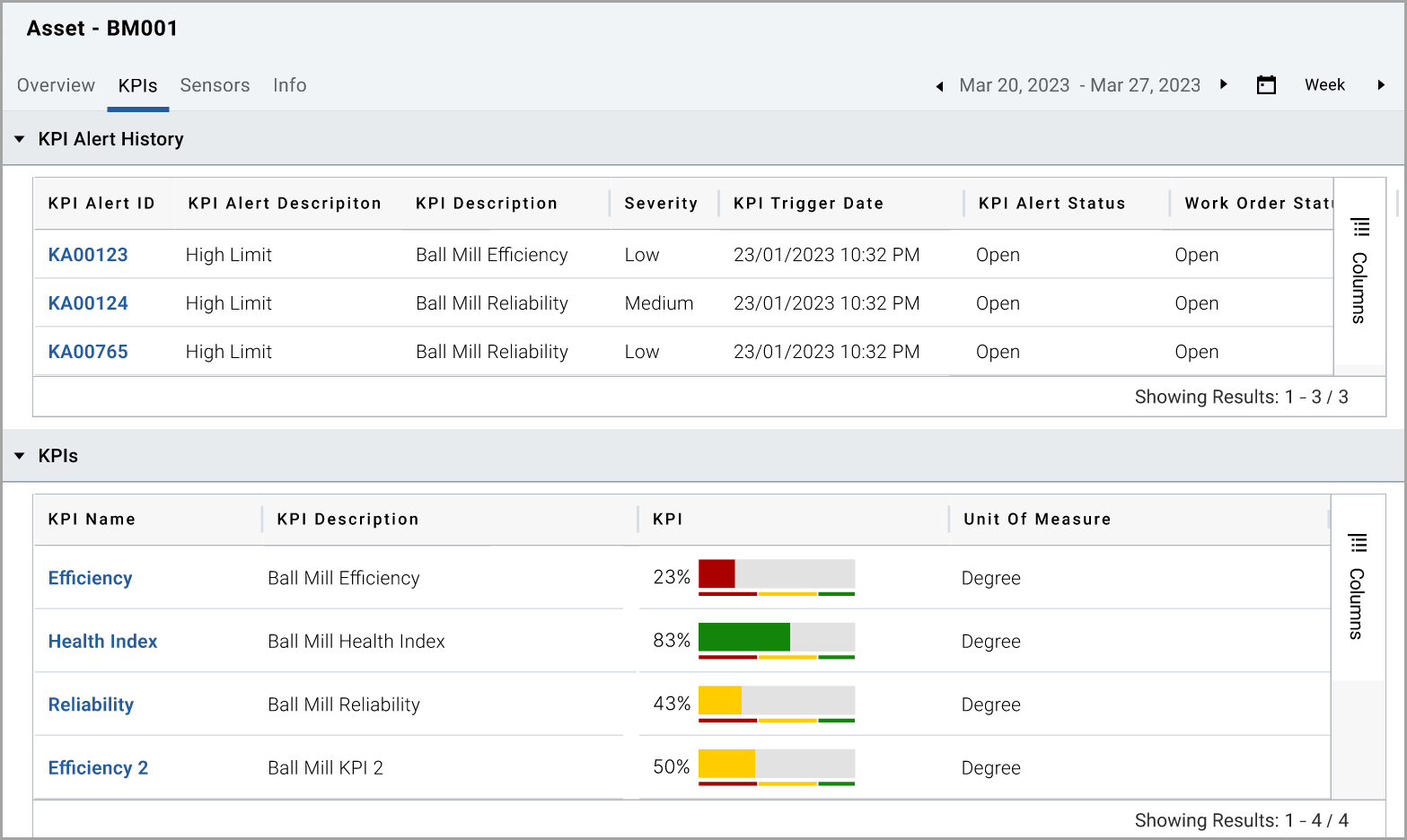
tab:You can view the KPI Alert history and the configured KPIs to the Asset for the applicable time period. The KPI alert history shows all KPI Alerts. Click on any KPI Alert ID to view more details on the KPI Alerts.
KPI Alert summary
NOTE:
You can use the [ ] in the respective column to filter based on your needs.
Click on any
KPI
, for example, the following image shows the Efficiency KPI and you can see how the KPI has been performing over time, against the configured limits. See the Configuration section for more details.KPI Trend

In the Trend chart, you can view both the trend at the top and the sparkline view at the bottom. You can change the date selection by using the selectors of 1/3/6 months, year to date [YTD], 1 year, and all. You can also use the sliding selector at the bottom to change the date selection.
The red horizontal lines indicate the configured KPI Alert thresholds of Low, Medium, and High and both the Upper and Lower thresholds for each. The following table provides additional information on the thresholds and the abbreviations used in the graphic.
Alert Severity | Alert Lower Limits | Alert Higher Limits |
|---|---|---|
Low | LAL | LAU |
Medium | MAL | MAU |
High | HAL | HAU |
The vertical dotted line shows today's value, the trend after today indicates the forecast KPI, and the trend before today shows the historical data.
The vertical grey bars indicate exceeded threshold areas.
Sensors
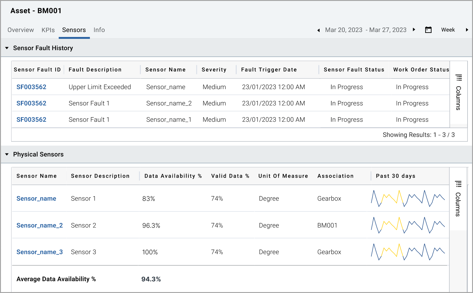
tab:You can view the sensor fault history, physical sensors, and virtual sensors.
In
Sensor Fault History
, you can view all sensor faults based on the selected time period. Click on any Sensor Fault ID
to view the details of the sensor fault alerts.In
Physical Sensors
, you can view the sensors list with description, Data availability%, Valid data %, Unit of measure, Association, and Past 30 days trend.In
Virtual Sensors
, you can view the sensors list with description, Unit of measure, Association, and Past 30 days trend.Sensor Summary tab
Virtual Sensors

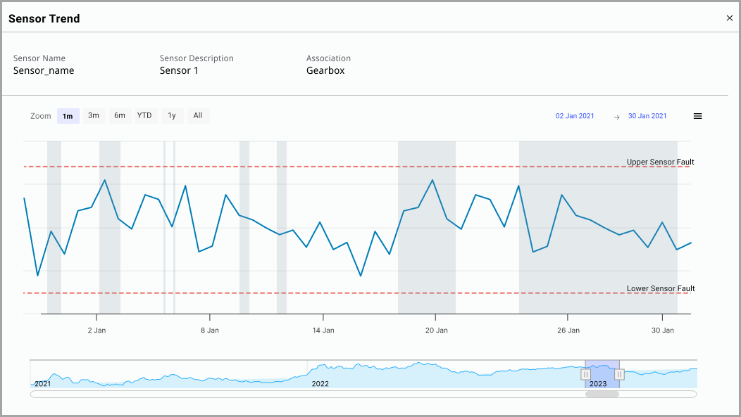
Click on any
Sensor name
from the Physical and Virtual Sensors section to view the Sensor Trend for additional details.Physical Sensor Trend
Virtual Sensor Trend

In the Trend, you can view both the Trend at the top and a sparkline view below. You can change the date selection by using the selectors of 1/3/6 months, year to date [YTD], 1 year, and all. You can use the sliding selector at the bottom to change the date selection.
The red horizontal lines indicate the configured Sensor Fault Alert Thresholds such as Upper Sensor Fault and Lower Sensor Fault. Vertical grey bars indicate the exceeded threshold areas.
Info
tab:You can view the general and system information about the Asset.
Asset Info

Provide Feedback
