Multi X Line Chart
A Multi Axis Line Graph functions like any other multiple or stacked line chart. However, this visualization uses multiple axes, giving you more flexibility in the data User can chart together.
User can turn on Stack to view multiple Y-Axis values on separated scales in views for Multi X Line Chart. Refer to “Stack” section for steps to turn on Stack.
- Open a Storyboard, hover the mouse on a chart tile and click the [
 ] icon to maximize the tile.
 - Click the [
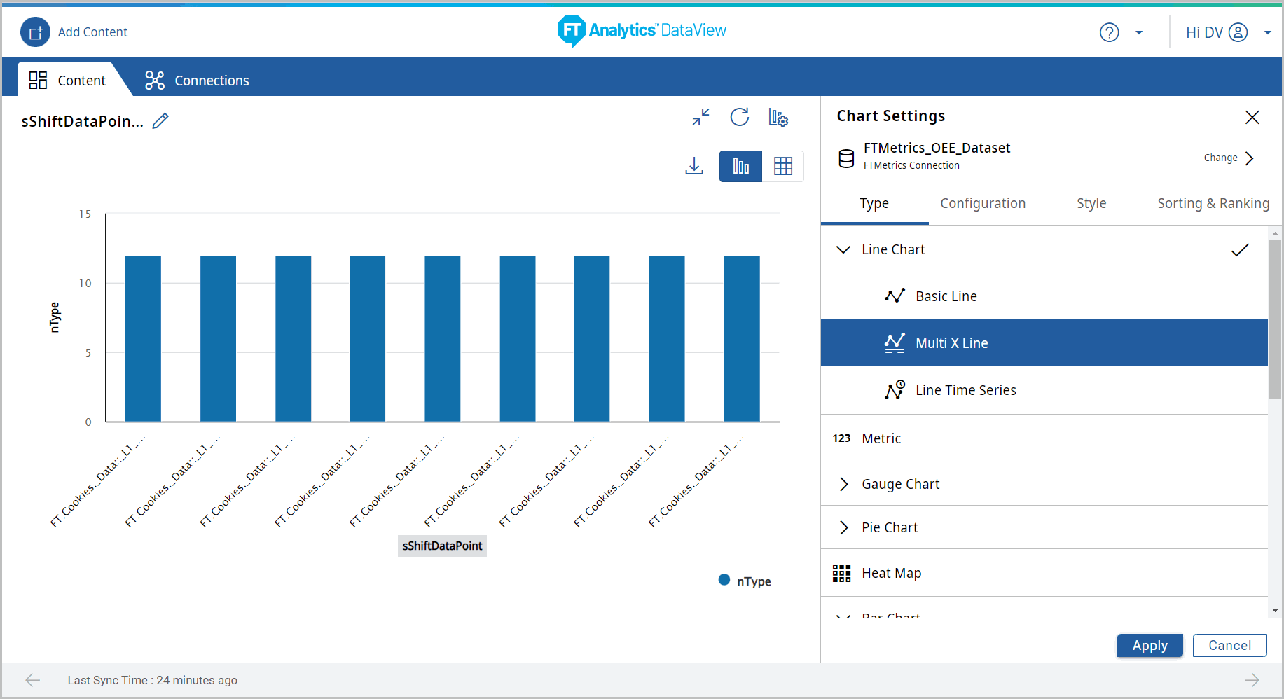
 ] icon. The Chart Settings window displays.View
 Under the Type tab, the list of available chart type displays.
 - Click [Line Chart]. The available chart models display.
- Select the [Multi X Line] chart from the Line chart section.Chart Settings
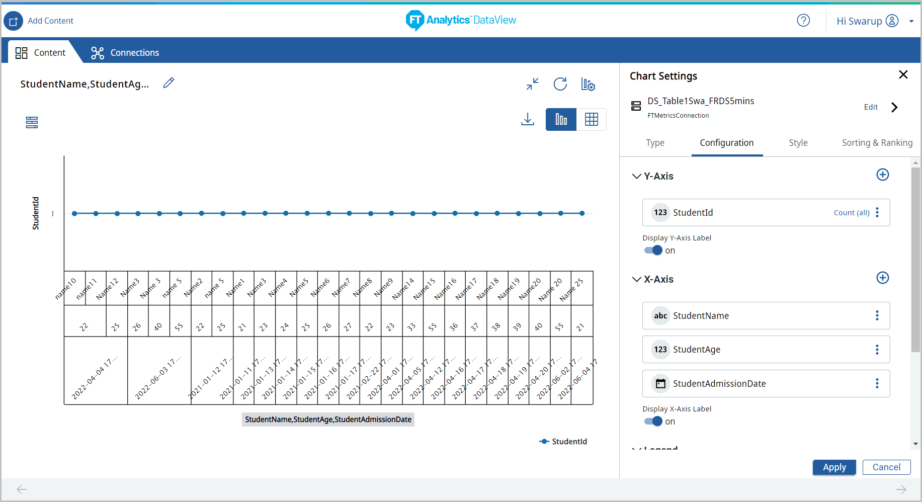
- Under the Configuration tab, provide the following properties:
- Y-Axis: Select the desired attribute using the [
 ] icon. User can add more than one Y-Axis values for this chart.
 - X-Axis: Select an attribute of date type using the [] icon.
- Tooltip: User can select the values to be displayed on the tooltip.
- Reference Line: User can set the properties to view the Reference Line on the Chart.NOTE:The Reference Line option is not available, if the Storyboard is generated with direct query.
- Under the Style tab, User can change the following:
- Chart Theme: Change the theme color.
- Chart Settings: User can enable or disable the following options:
- Chart Title, Cross Hairs, Data Label, and Grid Line.
- Click [Apply].Chart Settings
 The Multi X Line chart displays.Multi X Line Chart
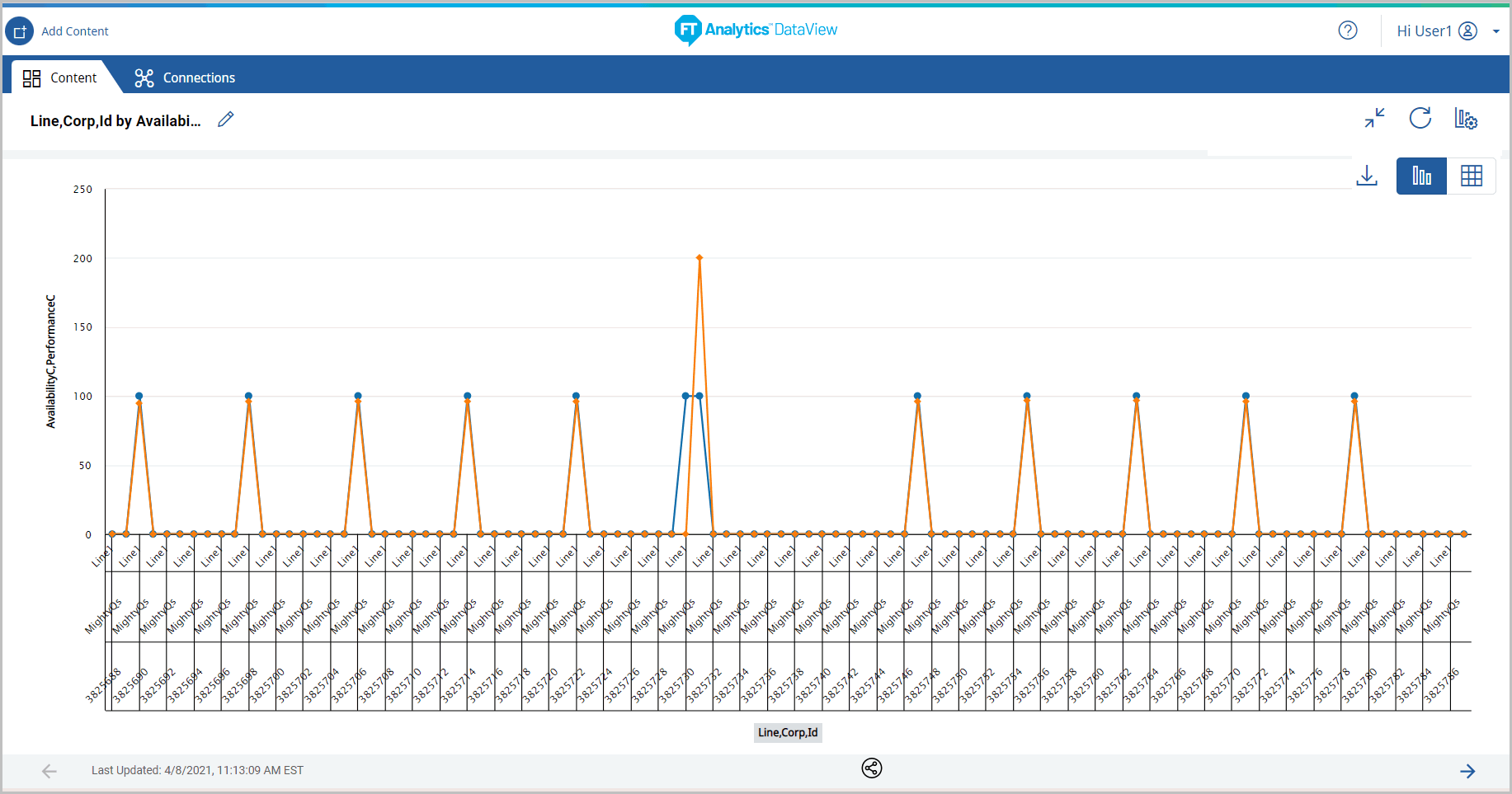
- Click the [
 ] icon to minimize the chart. The updated Storyboard displays.Storyboard Updated
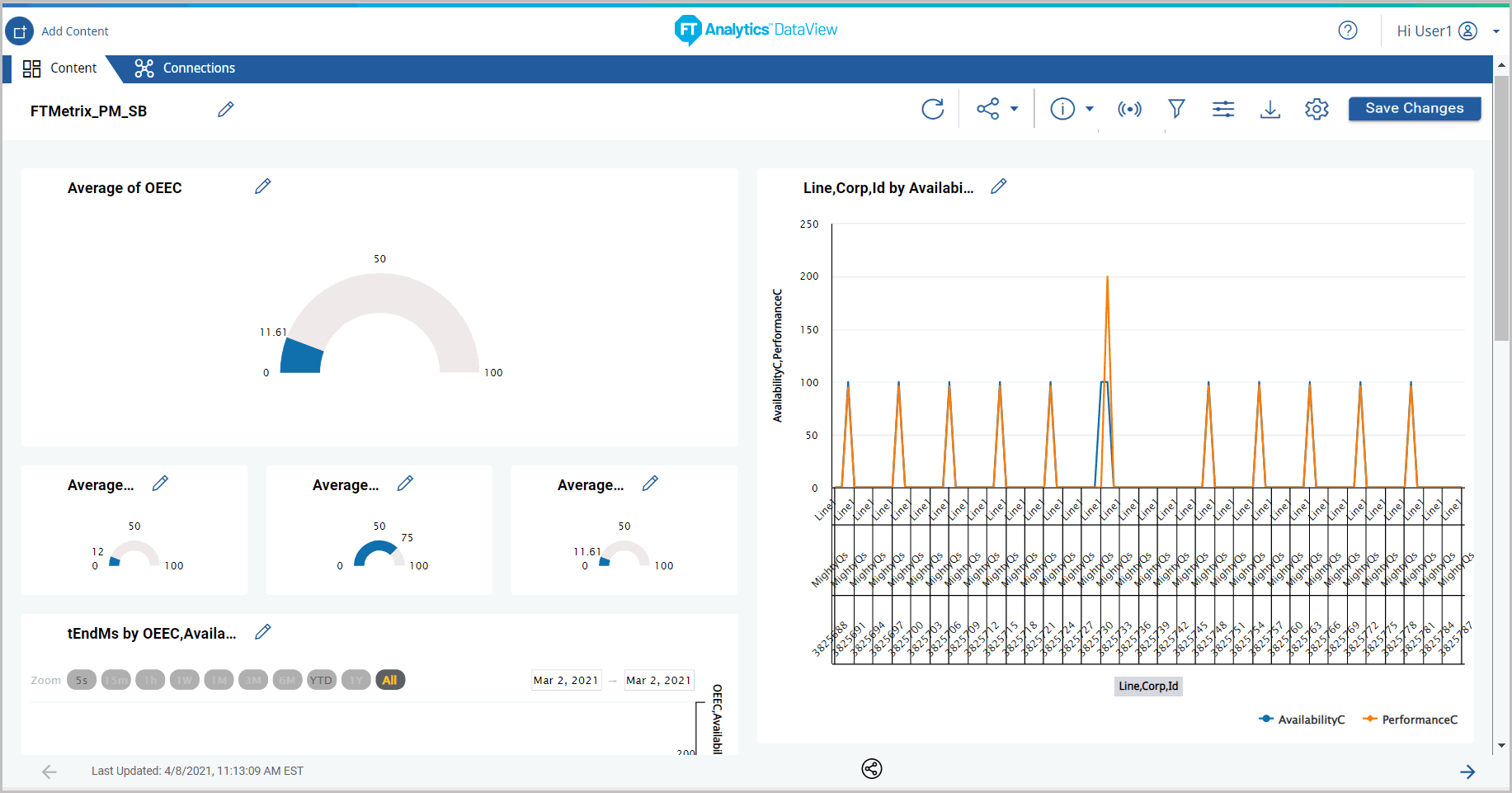
Provide Feedback