Correlation
A Correlation plot shows linear correlation values. For the equations, see any standard textbook on statistics.
NOTE:
The
Linear
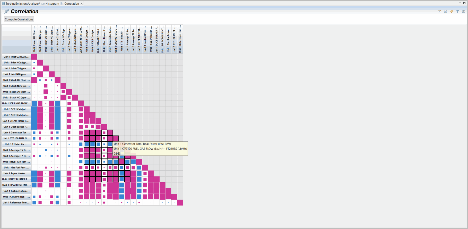
algorithms used for the Correlation plot do not detect nonlinear correlations. Variables in your dataset may be strongly related nonlinearly even though the Correlation plot indicates only a small correlation. The xy plot or the Virtual Online Analyzer analysis tools can support discovery of nonlinear relationships.The graphical representation of Correlation data is as a series of colored squares. The range from -1 to +1 times the value of largest magnitude is divided into a number of equal portions, and each portion is assigned a color. The colors are sizes of blue for negative values and sizes of red for positive values. The size of each square is proportional to the magnitude of the value.
There is no graphical adjustment on Correlation plots directly. Click [Compute Correlations] to recompute correlations (computed when screen is opened) when cuts or filters are changed. All Correlations are mapped to correlations on the same row (no time shift). To investigate correlations between variables over time, select either“Delay Correlation” or“Ranked Correlation” and then select a time range to search.
NOTE:
The Correlation plot is limited by the limit set under the Preferences for Correlations. If you do not see all the selected variables you want, you may need to update the limit set under the Preferences.
To select a group of data in a Correlation plot, drag your mouse over the section you want selected. Selected Correlation plot variables provide only the option to generate new Plots (all types), Statistics (all types) and generate an Export on selected data. Note black lined blocks selected in the below example.
Correlation
Provide Feedback