Site/Area/Work Center Level Dashboard
You can view charts of energy consumption and emissions of all electrical and non-electrical energy types based on the time period selected from the date picker. The dashboard is similar for Area, Work center, and Site level.
Perform the following steps to view, show/hide, and filter charts:
- Click the [
 ] icon from the menu bar and selectSite, orArea, orWork centerfrom the hierarchy list.The following table provides the list of charts available by default in the dashboard:Chart TypesS.NoChart NameDescription1Total consumption widget by Resource typeThis is the overall summary of the total energy consumption with the values of each resource type.2Total cost widget by Resource typeThis is the overall summary of the total cost with the values of each resource type.3Total emission widget by Resource typeThis is the overall summary of the resource emission with the values of each resource type.4Total energy consumption widget (Harmonized)This shows the overall energy consumption summary.5Energy consumption chartYou can view the selected time period with the respective granularity on the X-axis and consumption on the Y-axis. This chart shows the overall energy consumption summary.6Total emission widget (Harmonized)This shows the overall emission summary.7Emission chartYou can view the selected time period with the respective granularity on the X-axis and emission on the Y-axis. This chart shows the overall emission summary.8Total production widget (Harmonized)This shows the overall production summary.9Production data chartYou can view the selected time period with the respective granularity on the X-axis and production data on the Y-axis. This chart shows the overall production summary.10Total energy intensity widget (Harmonized)This shows the overall energy intensity summary.11Energy intensity chartYou can view the selected time period with the respective granularity on the X-axis and energy intensity on the primary Y-axis, production data on the secondary Y-axis. This chart shows the overall energy intensity summary with the comparison of production data.12Total cost widget (Harmonized)This shows the overall energy cost summary.13Cost chartYou can view the selected time period with the respective granularity on the X-axis and cost on the Y-axis. This chart shows the overall energy cost summary.14Total consumption -Production data chartYou can view the selected time period with the respective granularity on the X-axis and consumption in the primary Y-axis, production data in the secondary Y-axis. This chart shows the overall consumption summary with the comparison of production data.15Electricity demand summary widget (Harmonized)This shows the overall electricity demand.16Electricity demand chartYou can view the selected time period with the respective granularity on the X-axis and electricity demand details on the Y-axis. This chart shows the overall electricity demand.17Natural gas demand summary widget (Harmonized)This shows the overall natural gas demand.18Natural gas demand chartYou can view the selected time period with the respective granularity on the X-axis and natural gas demand details on the Y-axis. This chart shows the overall natural gas demand.19Total consumption widget (Harmonized)This shows the overall energy consumption.20Energy consumption - Heat mapThe X-axis and Y-axis granularity values representation based on your time period selection. This chart shows the overall consumption summary in the heat map format with color representation.
 - To see the data, hover over the bar in the required chart.NOTE:Click the [
 ] icon to view the chart in the widget view. Click the [
 ] to switch the view from widget to chart.
 - To remove the chart from the dashboard, click the [
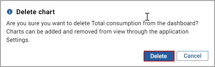
 ] icon from the respective chart.
 - In theDelete chartdialog, click [Delete].Delete chart dialog
 The "Chart remove successfully" message displays.
 - To add or show the chart in the dashboard, click the [
 ] icon from the top-right corner of the Site or Area, or Work center dashboard.
 - Select the required chart check box to add to the dashboard and click [Save].Site/Area/Work center Dashboard chart settings
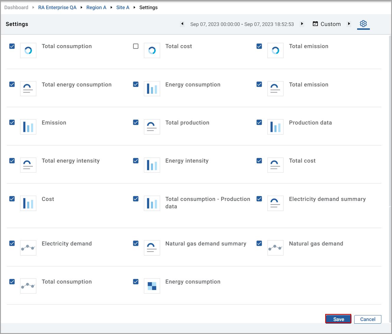 NOTE: To remove the chart from the dashboard, uncheck the required chart check box and click [Save].The “Dashboard setting changes updated successfully” message displays.
Perform the following steps to change the chart time period:
- Click the [
 ] icon.
 - Select theDateorWeekorMonthorYear, orCustomfrom the drop-down list and the calendar displays.
- Select the time period.
- Click the [] and [
 ] to move forward and backward period of the selected time period respectively.NOTE: If you selectCustomfrom the drop-down list, you need to select theFromandTodate and provide the time manually.
Related Information
Provide Feedback